
Website basics: How to create a row of books
By Maria Korolov
In reviewing the best author websites of 2021, I noticed that one element that many of the sites had in common was a panel showcasing the author’s books.
So when I set up the free Indie Writer Jones website, that was one of the first panels I created.

I’m going to explain, in painstaking detail, how you can do the same.
Before you start, you will need to have your book covers ready, and you will need to have your WordPress website set up. If you don’t have a WordPress website, here’s my tutorial on how to set up a free WordPress site that looks exactly like this Indie Writer Jones demo site. I even filmed a video of me doing it, in real time, in under 50 minutes.
But I went through everything pretty quickly in that video. If you blink, you’ll miss it!
So today, I’m going to focus in on just one element: the row of books panel.
For this example, I’m using WordPress.com‘s free Rockfield theme, but you can do this with pretty much any WordPress theme, as long as you have the latest Gutenberg blocks feature enabled. It’s in my default on WordPress.com, so you don’t have to worry about it. If you’ve somehow managed to turn off Gutenberg blocks, or your website designer turned it off, pull up your WordPress admin panel and go to Settings>Writing. The third item is “Default editor for all users.” Switch to “Block editor.” Or, in the next item down, under “Allow users to switch editors,” click on “Yes” to be able to switch back and forth. If you don’t have this option visible then you’re already using Gutenberg blocks — or you haven’t updated your WordPress for the last few years. In which case, go update it, then come back.
The static image
One of the easiest thing to do in Gutenberg blocks is to add an image.
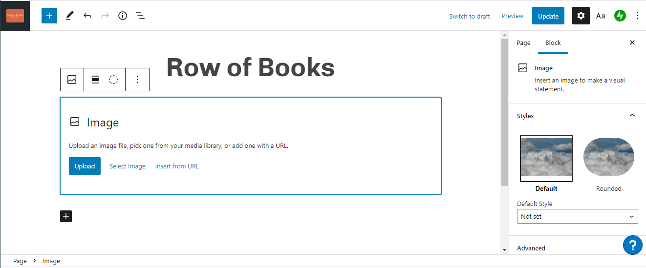
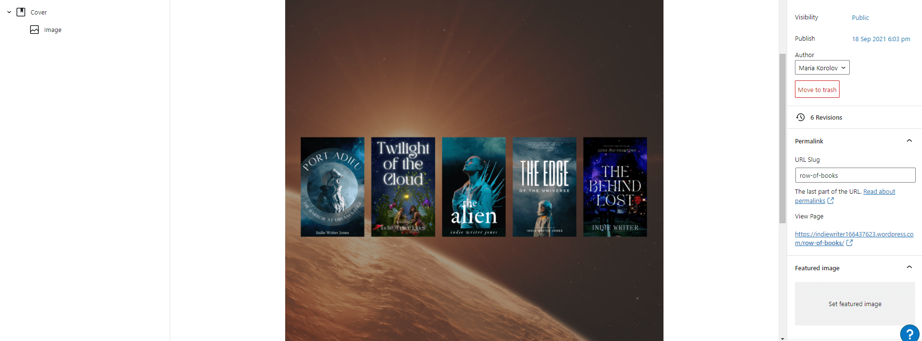
So, I created a new page — go to your admin panel, then under “Pages” click on the page where you want to add your panel. So, if I was building this site, I would click on the “Home” page. But I’m going to set up a new demo page for you guys, on a demo site, and have a page just for all my row of books panels. So I went to “Pages” and clicked on “Add new”, then in the title field entered “Row of Books.” You can see the final Row of Books page here.
![]()
Now, I should click on that line that says “Type / to choose a block” in gray. But wait! I don’t have an image with my row of books yet!
I’m going to have to go and make one.
First, though, I’m going to look at some author sites for inspiration.
Jeaniene Frost uses a single image to show off some of her books:

So does Ben Aaronovitch:

Now, I’m not that good an artist, so I can’t do what Ben Aaronovitch did. But Jeaniene Frost’s image looks very doable!
I’ve already got my covers made, after all. (I made them while writing this article about creating content for your author website and in making this video.)
So I’m going to go into Canva and create a blank new image that’s 1000 pixels wide by 250 pixels high. (I like round numbers.) I’m going to grab five of my sample covers and arrange them on the page, then use one of the images from one of those covers to create a cool background. Then I’ll add some text.
I’m timing myself to see how long it takes me.
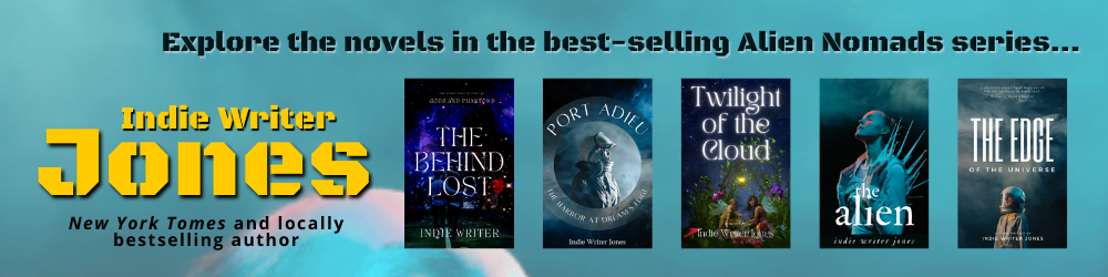
Okay, it took me 20 minutes. Most of that I spent playing with the fonts. Looking at it now, I’m thinking I should have spent more time on the fonts. And maybe adjust the colors a little bit. But I’m going to exercise some self-control and stop fiddling.
Now let’s go back to our site and add it in.
I click in the area that says “Type / to choose a block” in gray and type a slash. Immediately, a pop-up list of block types appears. I click on “Image,” then the blue “Upload” button and select the image I just saved from Canva.
I want to see what it will look like on the page, so I hit the blue “Publish” button at the top right. If I’ve already published it, then the blue button will say “Update.”
If I go to my website to the page I’m working on — for you, this might be your Home page — I will now see the block, on the page.
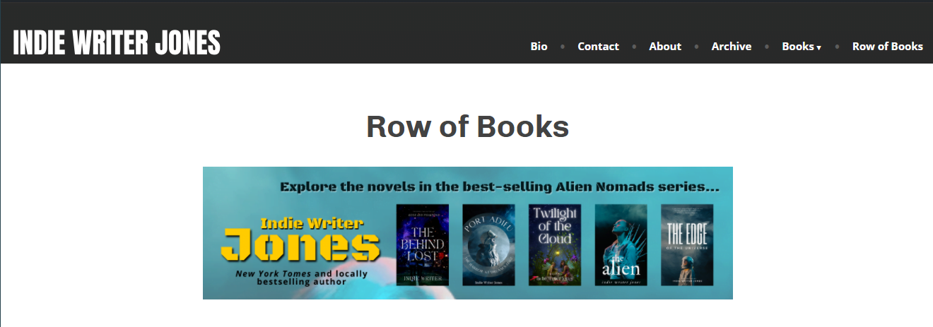
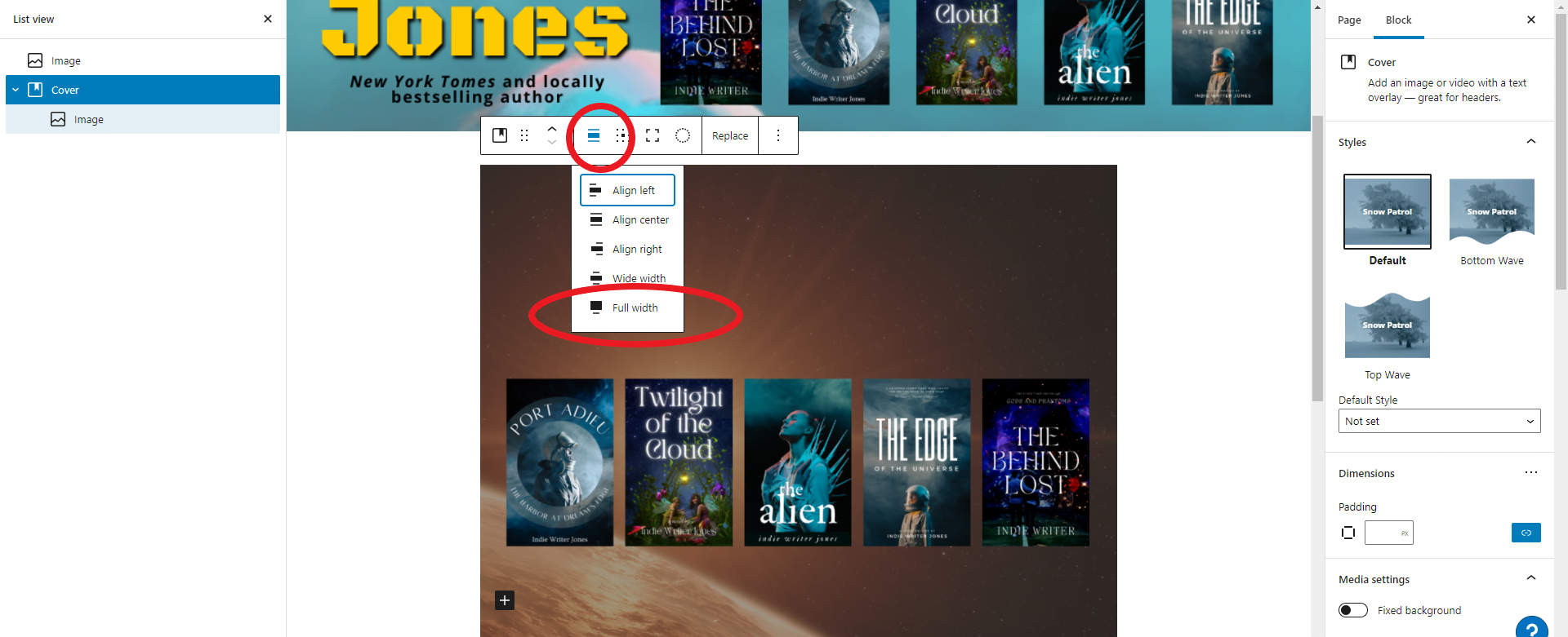
I don’t like it. It’s too narrow. I want it to be a wide panel, going the full width of the site.
Back to the window where I’m editing the page.
To make the image wider I’ll need to “align” it. The alignment button appears when you click on the image — it’s the third button in the pop-up toolbar, and looks like three horizontal bars, the middle one slightly thicker than the others.

Click on the “full width” option.
Now the image will take up the whole width of the page.
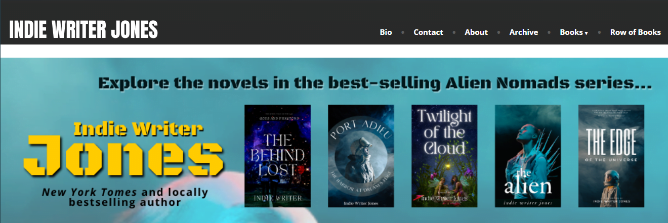
Ta da!
Creating the panel took less than a minute — much less than the time it took me to create the actual image!
Now there’s one more thing I can do. If someone clicks anywhere in that image, I want them to go to a different page that’s just a list of all my books and where to buy them, or just to my Amazon author page.
To do that, I go back to the window where I’m editing my “Row of Books” page and click on the image. A little tool bar pops up.
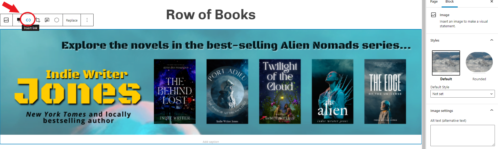
The button to create a link is the third in line — I circled it in red above. Click on it, and paste the link.
Once the link is in place, I can set it to open in a new tab, if I want — click on the image, click on the link icon, then click on the little down arrow at the far left and select “Open in new tab.” This is a good idea if the link takes people to a separate site, like to Amazon.
Are you wondering about that panel at the far right? The one that has the “Page” and “Block” tabs, and whenever I click on an image it changes to show me the settings for that image, such as whether it’s square or rounded? That’s the settings panel where you can customize either the whole page, or just the particular block you’ve got selected.
And we are done.
Now, you might be saying about now, “That is pretty easy. Can’t I make my whole site just rows of these image blocks?” And the answer is: “Yes, yes you can!” And some of the best, most successful authors out there do just that with their sites.
So if you don’t want to learn anything else about WordPress, you can go to your favorite image program of choice and make your panels and never think about WordPress again.
Go ahead. I don’t mind. You can always bookmark this page and come back to it later if you want to want to get that cool moving-background-image effect.
Oh, you’re still here?
All righty then!
Cool moving background effect
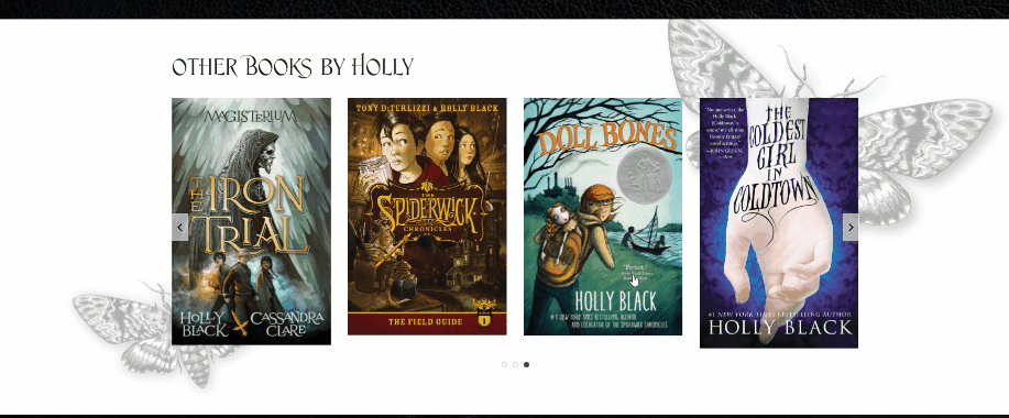
If you go to Holly Black’s website and scroll down, you’ll see a row of books titled “Other Books by Holly” arranged against a a gray butterfly background. And when you scroll up and down, the background moves. This is called a parallax effect.
It used to cost money. Now it’s available for free.
Now, Holly Black also has a carousel effect there that rotates through all her books, and we’ll get to that later down in this article, but for right now, let’s just focus on the parallax effect.
I’m going to take my row of books image and put it on a cool space background.
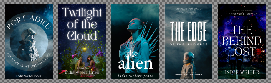
First, I need an image that has space between the books. That’s called transparency, or an “alpha” layer.
So, first, I’m going to create an image with emptiness between the book covers. I’m using GiMP, a free, open-source alternative to Photoshop. Google Drawings can also do transparent backgrounds. So does Canva, but you have to upgrade to their pro plan, which is $120 a year.
Here’s my image in GiMP, where the gray checkerboard shows the transparent areas.
Now I have to find a nice image for the background parallax effect. I want something light, so the dark book covers pop.
I’ll check out NASA’s space photos. All their images are public domain, so free to use for any purpose whatsoever. My tax dollars at work!
NASA’s own site is hard to search. They have filters, but they have so many images that it’s hard to find something good. I generally just use Google’s image search, and search for something like “site:nasa.gov sun and earth” — “site:nasa.gov” tells Google to just search NASA’s website. Wow, there are some good-looking images there. I can spend hours scrolling through them.
I’m going to use this image:

Back to my page.
First, I click on the area where it says “Type / to choose a block” in gray text, under my previous book row panel.
For the type of block, I’ll choose “Cover.” That’s what WordPress calls blocks with background images. If “Cover” isn’t one of the immediate pop-up options — I think WordPress gives you the blocks you use the most, or something — you can just type “/cover” and it will come up. Then I upload my image.
It will have white text in the middle that says “Write title…” — I’ll click there, then hit “/” and choose “Image” from the pop-up list, and add my new image with the row of books on a transparent background.
Now I just get the two images on top of each other.
Nothing too exciting. Yet.
Notice the panel on the far left-hand side of the screen? It’s a list of blocks. The “Image” block is indented — that shows that it’s inside the “Cover” block. You can click on the little down arrow to the left of the word “Cover” and collapse that part of the list, or expand it again. This is useful once you have a lot of blocks on your page, with blocks inside of blocks, inside of other blocks.
You can think of blocks as nested Russian dolls — or nested Tupperware containers.
First, let’s make the “Cover” block the whole width of the screen. Click on it — either on the picture itself or on the word “Cover” in the left-hand sidebar. In the pop-up toolbar, choose the alignment icon and make it “Full width.”
Now, look in the panel to the right. About half-way down, you’ll see “Media settings.” Enable the first option, “Fixed background.” Now try scrolling — you’ll see your row of books moving against that background.
If you scroll that right-hand sidebar all the way down, you’ll also see an “Opacity” setting. By default, it’s at 50 percent. I’m going to reduce that down to zero, so the background really pops. Now it looks like my book covers are floating in space above an alien planet.
But the row of books feels a little narrow to me. I’m going to make them wider, by clicking on the books image, and changing its alignment to “Full width” as well.
And I mustn’t forget to make the image with the row of books a clickable link. Click on the image, click on the “link” icon in the pop-up toolbar, then paste the URL. Done!
Now I hit the blue “Update” button at the top right and switch over to the window where I’m looking at the actual page. And here’s the parallax effect:

Oh, and in case you’re curious about how I made these animated GIFs, I used the free ScreenToGif app for Windows.
If this was my real website’s home page, I’d want this panel to be at the very top. To move panels, just click on the panel you want to move, then click on the up or down icon to move them up and down.
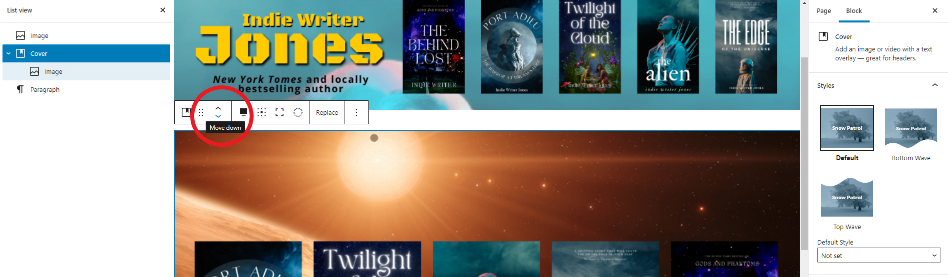
Or you can click on the icon one over to the left, the one with the six dots. That’s the drag tool. Click on it, and you can just drag the whole panel to where you want it. Keep an eye on the block list in the right-hand bar, to make sure you’re moving the whole panel, with all of its blocks, and not just one of the interior blocks. If you mess up, just hit undo — Ctrl-Z.
Oh, and did you notice that the right-hand sidebar also has “Bottom Wave” and “Top Wave” options? Never never click them!
Just kidding. Go ahead and click them. It will give your background image a cool wave edge. I’m not going to use it here, though, because I don’t like the way it looks with my chosen images.
Whew. This was a lot. If you’ve had enough WordPress for the day, you can go home. I mean, with this cool parallax effect your free site already looks better than 90 percent of the professional websites out there.
But what’s that, you say? You want each book cover to be its own clickable link?
We can do that!
Blog Posts
The quickest way to create a row of book covers where each cover takes you to a different page is to use the “Blog Posts” block.
The trick is, though, that you have to set up a separate post page, or a separate page page, for each book. You probably already have those pages, but if you don’t, you’ll need to create them.
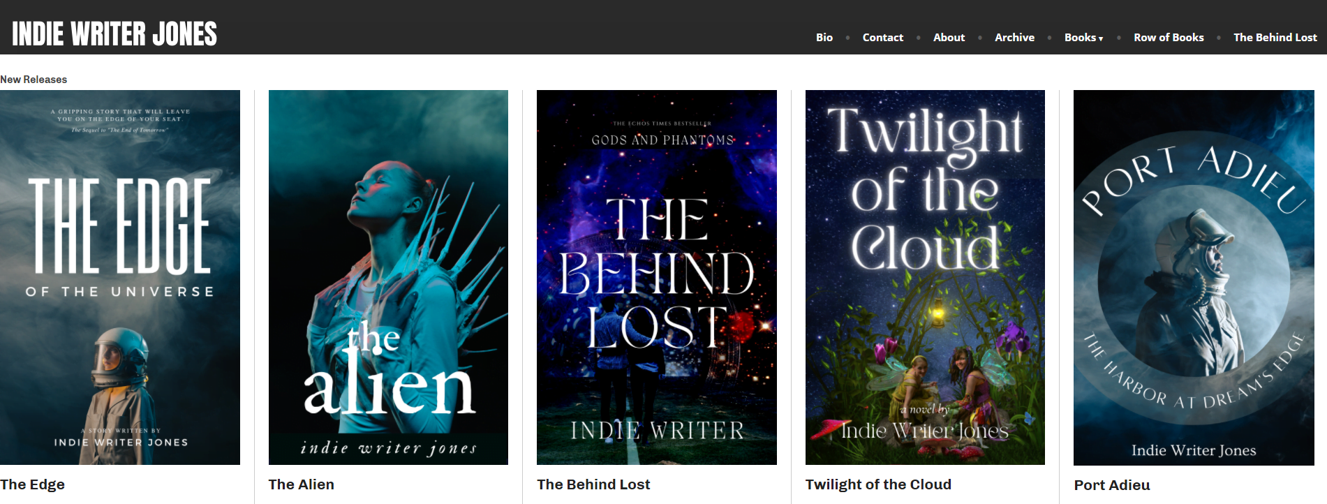
I created a new page for each of the books in Indie Writer Jones’ best-selling sci-fi series. Each one has the book cover image, a link to the book’s page on Amazon, and a blurb about the book. For example, here’s the page for the Twilight of the Cloud book.
It’s not great, I just wanted to put something up. Later on, I might come back and make them pretty, and walk you through a bunch of different design options for books pages, but for now, let’s just go with what I’ve got.
Go to the bottom of your home page — or, in my case, my Row of Books page — and click on the black plus icon to add a new block. Or you can click on an existing block, then, in the pop-up toolbar, click on the three dots at the far right and choose “Insert after.”
Then either select “Blog Posts” from the block options or type “/blog posts.”
By default, it shows my latest blog posts.
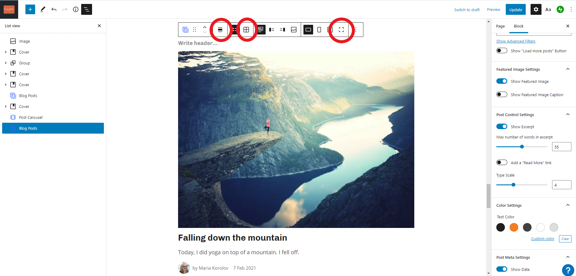
In the image above, the three red circles are three settings you’ll need to click.
The first one is the alignment — set it to “Full width.” The second switches your blog posts to “grid view.” The last one makes your images full size — you don’t want your book covers cropped.
Then look at the right-hand settings panel.
The first option gives you a choice of “Default” and “Borders” styles — I’m going to go with “Borders” to get a little gray line between the books. Just so it looks different.
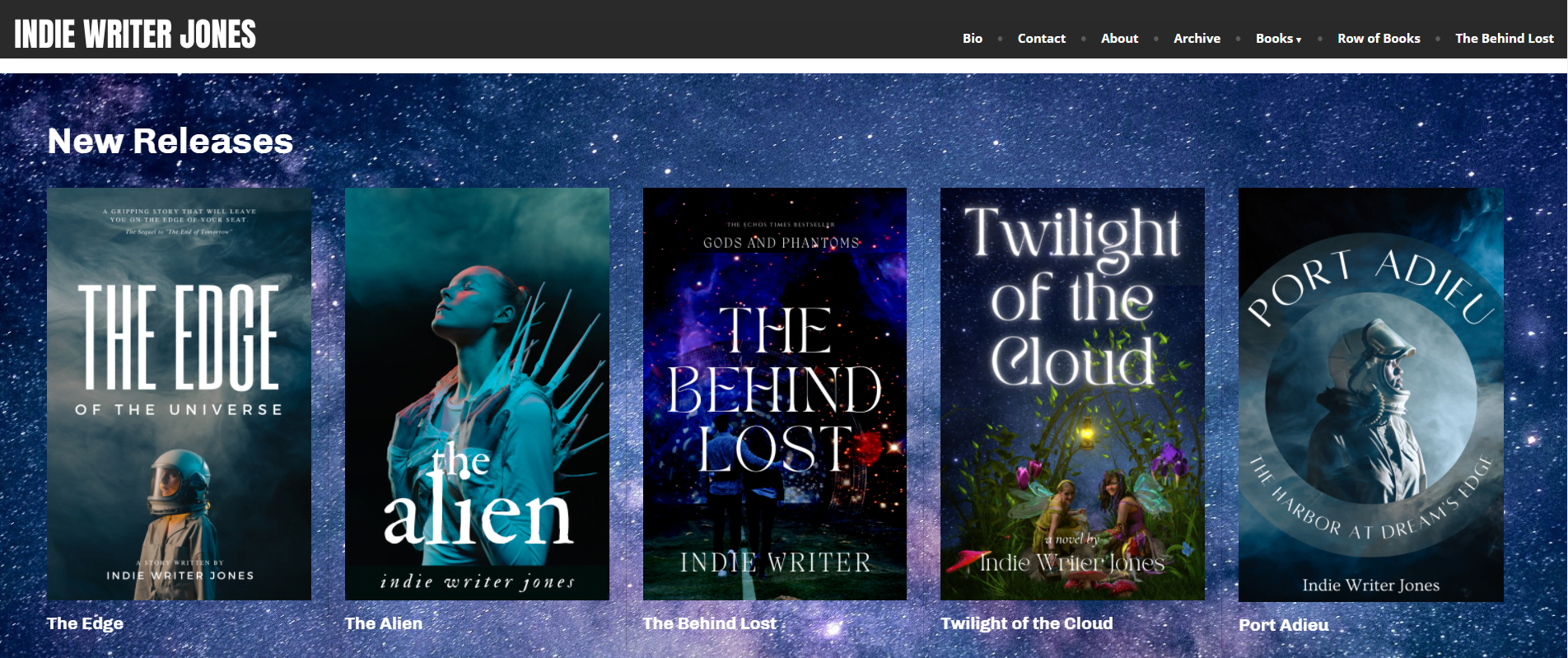
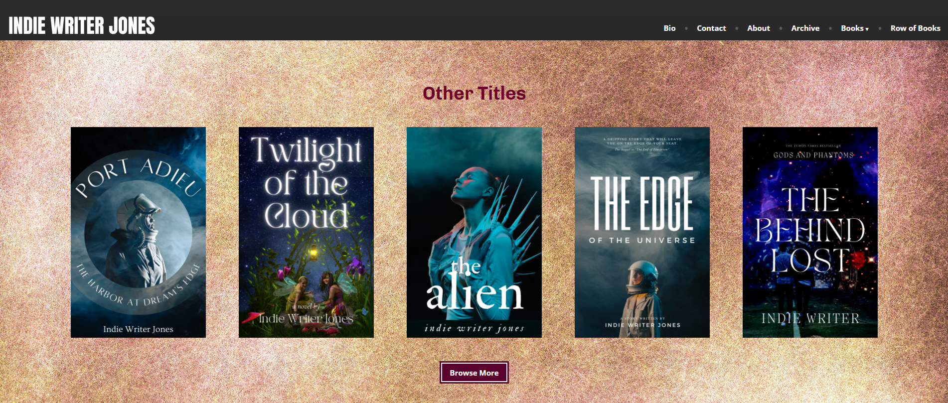
Then, under display settings, turn “Choose Specific Posts” to on, and under “Number of Items” put how many books you want to show. I want five. Then, under columns, I’m going to put five as well. If you had more books than Indie Writer Jones does, you could show, say, ten books, in five columns, giving you two rows of five books each.
Further down, under “Post Control Settings” turn off “Show Excerpt,” set “Type Scale” to three, and under “Post Meta Settings” set them all to off — no date, no author.
Finally, under “Post Types”, select “Pages.” Unless you created “posts” for each of your books instead of “pages.” In which case, leave it as posts. But I set up my books as pages, and I recommend that you do the same.
Finally, last bit of all — scroll back up to the top of the sidebar, to “Display Settings,” where you’ve enabled “Choose Specific Posts.” In the field immediately below that, start typing your book titles.
Before I finish with this panel, I’m going to click on the gray “Write header…” text and type in “New Releases.”
With this block type, I can’t get rid of the book title under each cover, and I can’t make the words “New Releases” any bigger.
What I could do, however, if I wanted to, is delete the “New Releases” text and make the block’s text color white. Then I can add a new “Heading” block above it and create any size of heading I want.
But wait, you say! The previous way to create a row of books let me put a cool image behind it. There’s no cool image here! It’s just a plain white background. That sucks!
Don’t worry. We can fix that.
Add a new block before or after your row of book covers and select the “Cover” option or type “/cover.”
Choose your image.
Use the “alignment” icon in the tool bar to make it “full width.”
Then click on the row of books you just created with the “Blog Posts” block and click on the second icon in on the pop-up toolbar — the six dots — and drag your row of books into the middle of the new cover image.
Ta da!
Now let’s fix it up a little bit, the same way we fixed up the cover in the previous section.
I’m going to add a title, “New Releases” and make the size “H2” and the alignment of the heading “Full Width” and the text color to white. I’m going to make the cover “Fixed Background” for the cool parallax effect, set the padding to “25” and the “Minimum height of cover” to “50” and the “Opacity” to zero.
And voila!
But you want more, you say? Maybe you want the covers to link directly to the Amazon book pages. Or you want to put “Buy Now” buttons under each book.
We can do that.
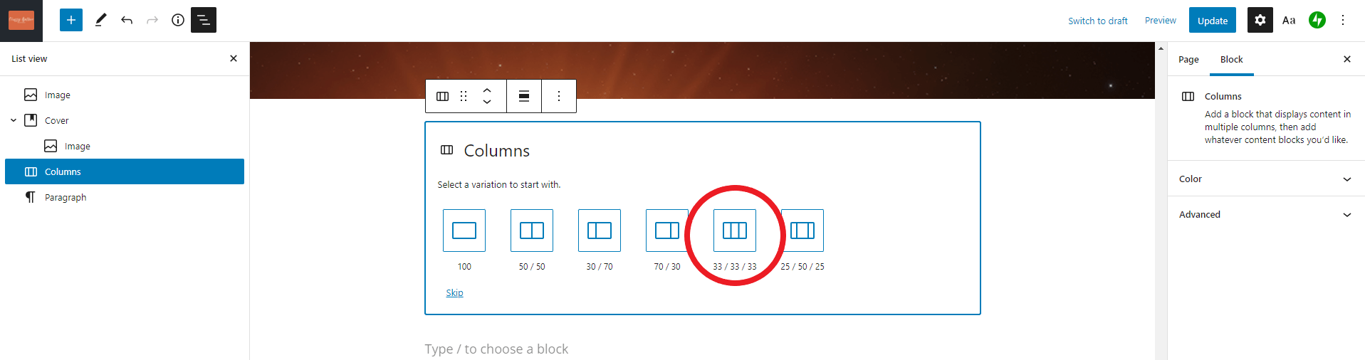
Let me introduce you to: the “Columns” block.
Columns of books
Let’s add a new block called “Columns.”
You can do it by clicking your cursor where you want the new block to be, then typing “/columns.” Or you can click on an existing block, then, in the pop-up toolbar, click on the three dots at the far right and choose “Insert after.”
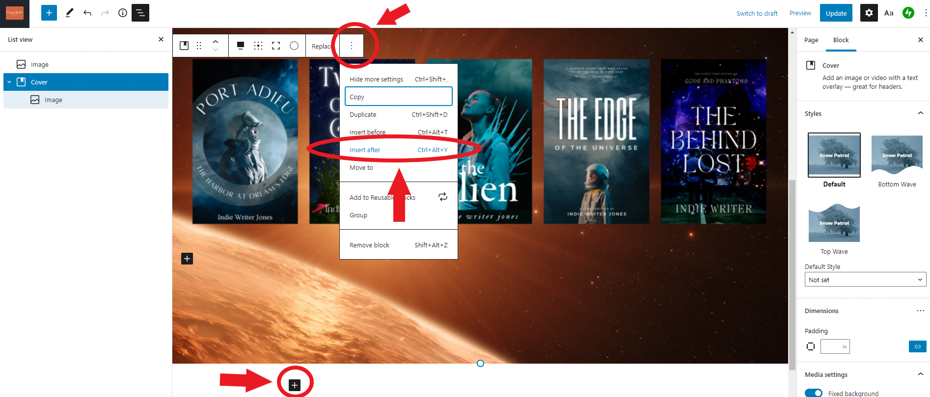
Or you can click on the black box with the plus sign in it below your other panel. Or you can just select the panel you want to add something after and hit the “Return key.”
Many ways to create a new block in WordPress. Many, many ways.
Anyway, we’re adding a “Columns” block. It gives you the choice of a few variations to start with. I want to have five columns, but that’s not one of the options — the closest I have is three columns. I’ll click on that.
Once you’ve added them, and you look to your left, in the “List view” sidebar, you’ll see that you now have four new blocks listed — a new “Columns” block and then three “Column” blocks nested under it. Yes, the “Columns” block doesn’t just add a single block — it adds four new blocks.
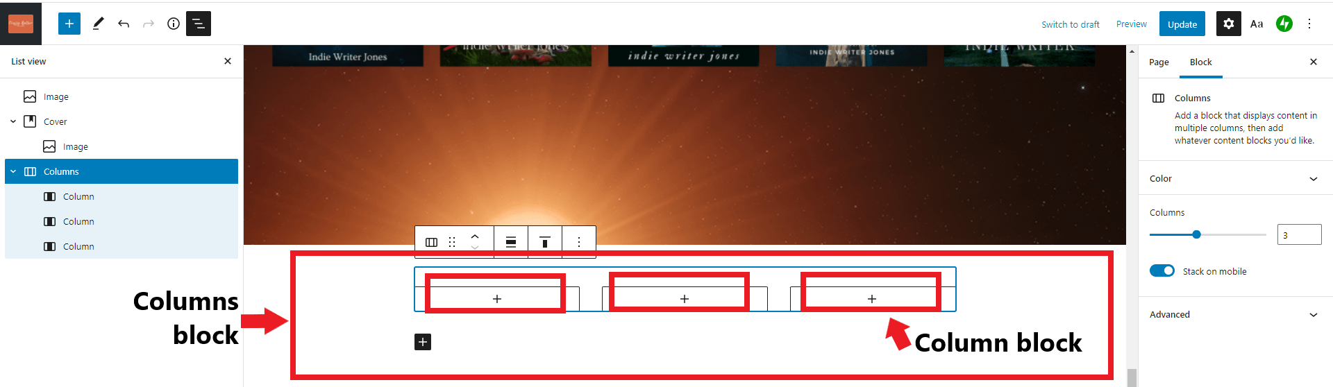
I drew the red lines and arrows above — WordPress itself makes it a little difficult to see the different block outlines — the light gray lines get confusing when there are blocks inside of blocks inside of blocks.
Like I was saying, it’s nested Tupperware containers.
First, let’s add some more columns. In the right-hand sidebar, there’s a section called “Columns” that’s currently set to three. I’m going to increase that to five. Now I’ve got five evenly spaced columns.
Those columns are empty right now, so let’s fill them. Click on the plus sign inside each column, and it will give you a choice of blocks you can add. I’m going to an an “Image” block and select one of the covers I’ve already uploaded to my image library.
I do that for each column.
Now I have a row of book covers. I’m going to make them each link to its own page, by clicking on each image individually and adding the links. Don’t forget that the button to add the links is in the middle of the top-up toolbar that appears when you click on the book cover image. You can see it circled below.

I can link to the book’s page on Amazon, or to another page on my website, or anywhere else my heart desires.
Notice the “List view” sidebar to the left now has an “Image” block nested under each “Column” block.
This row of books is a little on the small side. I can make it full-width by selecting the outer-most block — the “Columns” block — and making it “Full width.” To select the entire “Columns” block I can click on it in the sidebar, or click on one of the book covers and click on the left-most icon in the pop-up toolbar — that’s the icon that selects the block that contains your block. Or I can click around in the general area of the book covers hoping that I’ll randomly click on just the right spot on the screen to select the block I want. That last option is usually the least effective one, so it’s always the one I try first.
Now that my row of books takes up the whole width of the screen, I’m going to fancy it up a little bit more, by adding a background color.
In the right-hand side panel, click on the “Color” section.
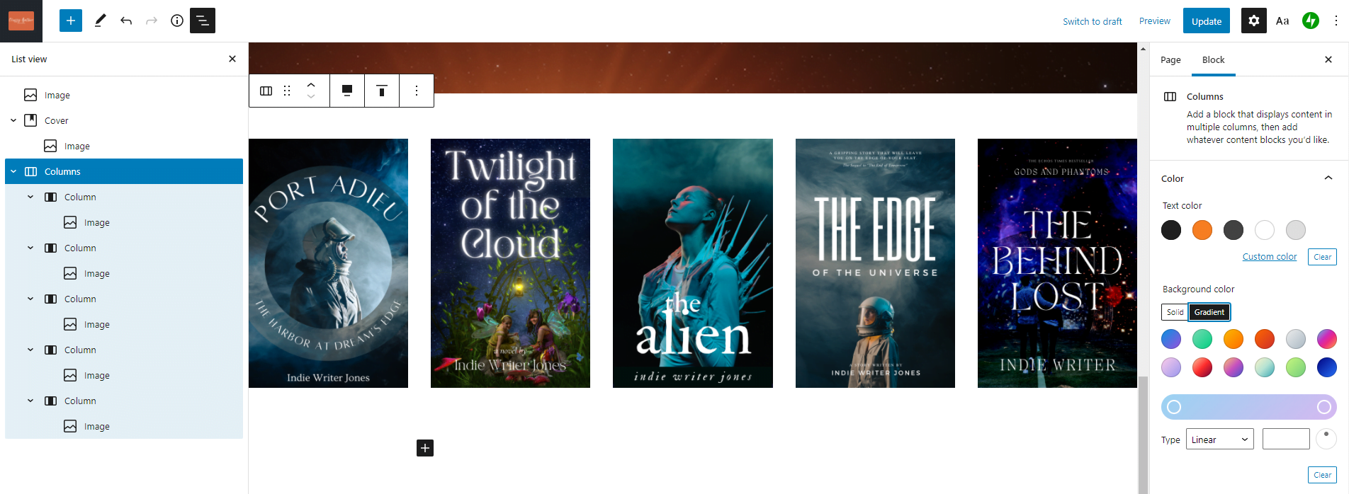
There are three options here. “Text color,” “Background color” and “Link color.” Let’s do the “Background color.” The default option is to have one solid color. You should totally do that, and pick a nice complementary color for the background. Don’t do the gradient option. That would look weird. Oh, hell, why not. Let’s do the gradient! Bwa ha ha ha ha.

Click on the little circle at the far left or the far right of the gradient color block and you can choose the color and the transparency level of the gradient. The transparency is there in case your columns block is sitting inside another block — like a cover block! — and you want the background image to show through.
Fancy shmancy!
Hit the blue “Update” button at the top right of the screen and let’s see how it looks on the page:
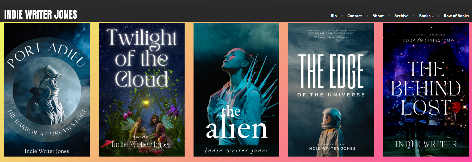
Whoa, Nelly! Just look at that.
But you know what? I can’t see much of that pretty, pretty background.
Let’s fix that.
I’m going to add 15 pixels of “padding” around each of the columns. Padding is empty space around a block.

Make sure that you’ve got the “Column” block selected when you do that, not the bigger “Columns” block that contains it, or the “Image” block that’s the actual image.
I set the padding for each of the columns, hit “Update” and checked on it on the final page:
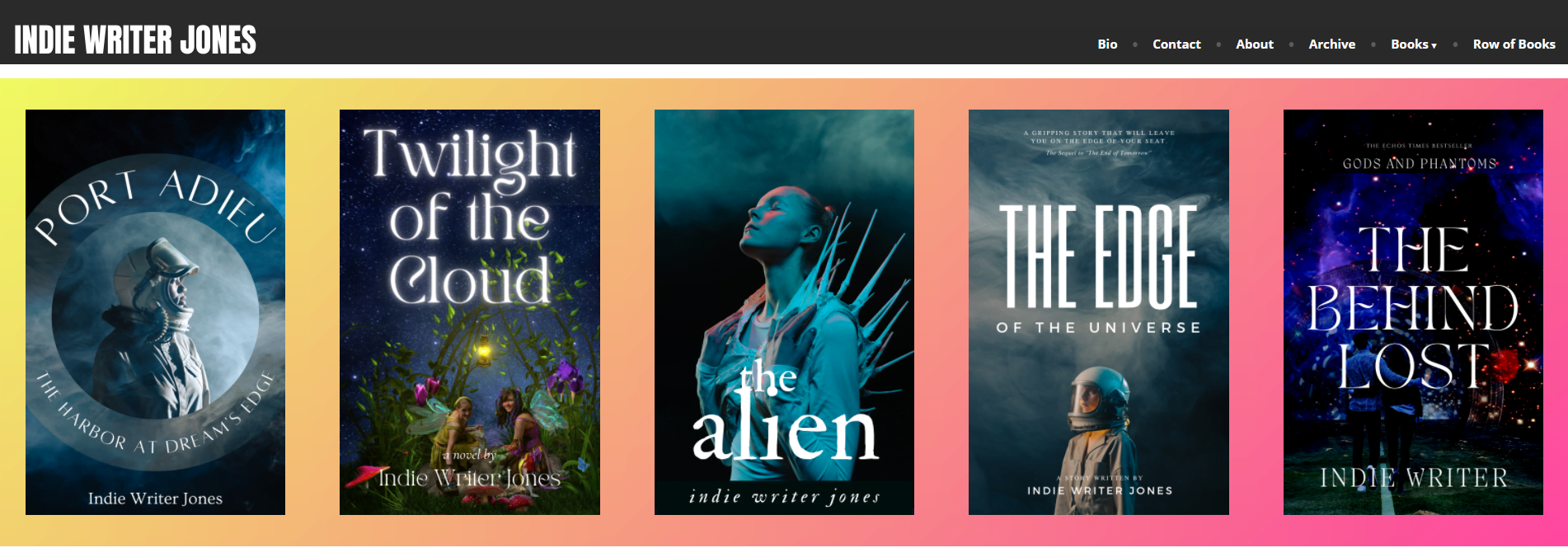
Better. But the outside border is smaller. Why is that, you ask? That’s because each column has 15 pixels of space on all four sides. So when the column is the first one, there’s only 15 pixels of padding, but when it’s next to another column, you’ve got the first column’s 15 pixels, plus the next column’s 15 pixels.
If only there was a way to make the padding on the outer edges wide… oh, wait, there is!
If you scroll up to the previous step, where I was setting the padding, you might have missed a little blue button to the right of the padding field. It looks like a link chain link. If you click on it, it “unlinks” the padding options — so now you can set the padding on each side of the column to a different size!

The padding options go in this order — top, right, bottom, left. If you forget, there’s a pop-up tool tip that shows up when you hover over the padding numbers. I’m going to set the left padding on the left-most column to 30, and I’m going to set the right padding on the right-most image to 30 as well. I updated it, didn’t think it was enough, and upped them both to 60. Much better!

Am I being a little obsessive? Maybe. But I want my fake books on my fake author page to look as good as they possibly can. And now you learned something about padding. Unless you already knew it, and I was just boring you. In which case, let’s move on!
The last thing I want to do before we leave the column section is to show you how to add headings and buttons below and after the columns, like on Mary Robinette Kowal’s website below:

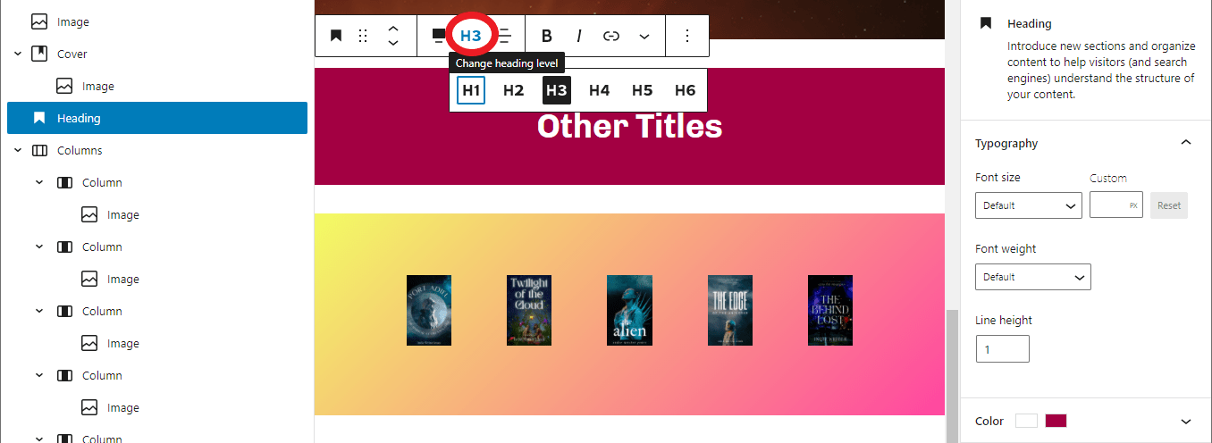
Let’s go back to our edit window and add a new block before the “Columns” block.
Choose the “Heading” block, type in the title — I went with “Other Titles” — choose the heading size in the pop-up toolbar above the block — I went with “H3” — and choose the text and background colors in the right-hand sidebar:
But woe is me! The “Heading” block doesn’t have that cool color gradient option. Now the heading doesn’t match my columns! I could change my columns to just have a solid color, but I want that gradient! Undo, undo, undo. Let’s get rid of that heading and try something else.
This brings me to the another super-useful block: the “Group.” At first blush, it doesn’t seem to do anything. It just groups other blocks together. But it does do something really great — it can set the background colors or gradients for several blocks at once!
So let’s go to our “Columns” block and put a “Group” block around it.
The two easiest ways to do this is to click on the “Columns” you want in the left-hand sidebar, then, in the pop-up toolbar above your “Columns” block either click on the first icon or the last icon in the bar.

Click on the blocks icon and select “Transform to Group.” Or you can click on the three-dot icon at the far right of the toolbar, and select “Group” from the drop-down menu.
Either way, your “Columns” block is now nestled inside a bigger “Group” block.
Now I choose the “Group” block and set the gradient for it the same way I previously set the gradient for the “Columns” block. Now I have two gradients on top of each other, which looks weird. I go to the “Columns” block, and in the “Background color” section hit “Clear” to get rid of its gradient.
Now I’ve got a group of blocks — well, a group of just that “Columns” block and all the stuff that’s inside it. But I can add as many more rows of blocks in there as I want.
For example, I can select the “Columns” block and click on the three dots in the pop-up tool bar and click on “Insert before” and insert a “Heading” block.
Then I center the heading, make it “H3”, and change its text color to a dark purple. Much better!
Now, Mary Robinette Kowal also had a button below her row of books. To add that in, I select my “Columns” block, click on the three dots in the pop-up tool bar, and click on “Insert after.” Then I insert a “Buttons” block.
If you can’t find “Buttons” in the drop-down menu, you can just type “/buttons.”
Then I use the toolbar to center the buttons, and click on the individual button to change its text and color. And I can add a link to it the same way I add links to images — by clicking on the button and then on the link icon in the pop-up toolbar above it.

Yes, the button has a white border around it that Mary Robinette Kowal’s doesn’t. But that’s from the Rockfield theme. If I really really wanted to fix it, I could create a little image of a button in a graphics editing program and add it in as an image with a link on it. And if I wanted to have a fancy font for the title, I could make an image there, too. But you know what? I’m not going to bother.
I’ve got a few other ways to do rows of books to get to!
Let’s see what it looks like on the screen:

And you know what? It doesn’t look too bad.
So let’s move on to background images!
Row of books with a background image
Just check out this row of books on Ann Leckie’s website:

If you click through to her site, you’ll see that she also has a funky animation effect in this panel, but we’re going to ignore that, because you can’t do that on a free WordPress site.
But the final result, a row of individual books, on top of a colorful background image, is actually really easy to do.
In fact, if you’ve read the previous two sections in this article, you already know how to do it — by combining blocks we already know.
Except this time we’re not just putting one block inside another block. We’re putting more than a dozen blocks inside another block.
First, add a “Cover” block with a pretty picture that’s going to be your background.
You can scroll up if you’ve forgotten how to do it. I’m going to make mine full width, with a “Fixed background” parallax effect and a 0 percent opacity.
Then I’m going to go up to my “Columns” block with the row of books in it, copy it, click in the middle of my new “Cover” block where it says “Write title…” and Ctrl-V to paste it in!
Or you could click on the “Write title” text and add a brand new “Columns” block by typing “/columns” and going through all the rest of the steps to add your columns of books, as per the instructions above.
And there you go:

If I wanted to add the “Other Titles” heading and “Browse more” button, then instead of copying just the “Columns” block, I would copy the whole “Group” block.
And then, after copying and pasting the whole group, I would go into the group colors settings and where I have the background gradient, hit “Clear” to get rid of it. In the image below, you can see the new sandy background peeking out from around the edges of the group with the color gradient in it.
![]()
And here’s what my row of books, with the heading and button, looks like on a sandy background, once the color gradient has been removed:
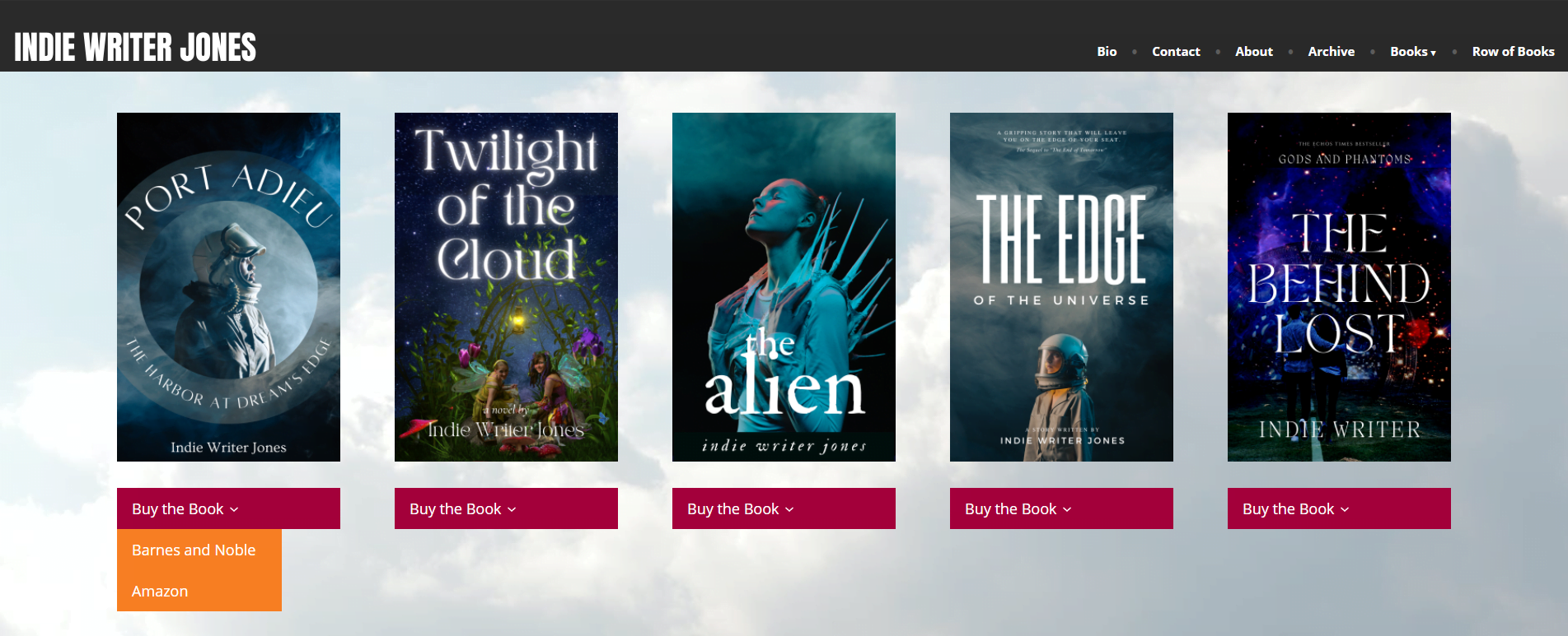
Let’s look at another inspiring example. Brent Weeks uses a row of books to show off all the books within a single series.

Some of this you can do right now, on your free site. The row of books can just be columns. The series title at the top of the panel is just a “Heading” block. And those “Buy the Book” buttons could just be buttons…. except… if you click through to Weeks’ site, you’ll discover that those red buttons are actually drop-down menus that show a list of all the different places where people can buy his books.
If you’re happy with a single button that just goes to the Amazon page, you’re good. If you want one of those drop-down buttons like he’s got — you can do that, too!
Now, this is a little advanced, but here are the steps:
- In your admin panel, go to Appearance > Menus and click on the “Create New Menu” button. Call it something like “Buy Port Adieu” — or whatever your book title is. It doesn’t matter what you call the menu, since the title won’t show up anywhere, but it should be something that you’ll recognize later for what it is.
- The first menu item should be a “Custom Link.” The URL should be the main page for your book, or your preferred shopping option and the text should be “Buy the Book.” This is the text that shows up on the menu when it’s all collapsed and looks just like a regular button.
- The second menu item should also be a “Custom Link.” The URL should be the book’s purchase page, on, say, Amazon, and the menu item text should be “Amazon” or “Buy on Amazon.” After adding the new menu item, indent it under the first “Buy the Book” menu item by dragging it over a skootch.
- Repeat the previous step until you’ve finished adding all the purchase options.
- Save the menu.
- Go back to your page, reload it, then where you would normally add a button under the book image, add the menu instead — the block is called “Navigation (vertical)”.
- Adjust the colors and text formats of the “Navigation (vertical)” block in the right-hand sidebar to be the way you want them.
Here’s what the menu creation dialog looks like when you’re customizing the appearance:

Now you have to do the same thing over again for each book in your row of books.
Yikes! That’s a lot of work!
Not hard work, mind you, just annoying work. But the end result could look pretty cool. In my demo, I made the menu background color purple and the overlay background orange — that’s the drop-down list the appears when you hover your mouse over the menu.
You can use this drop-down menu trick for other things, too. For example, you can have a picture of the first book in the series, and put all the other books in a drop-down list below it.
This was hard. Let’s go back to something easy that’s still interactive and looks cool.
Post and page carousel
You might have noticed that a lot of authors have moving rows of books. You can do that, too, for free.

Michael Crichton has a moving row of books at the bottom of his site. They’re a little hard to see in the picture above, but there are little gray arrow buttons on the left and right edges.
This is called a carousel.
I personally am not that fond of using carousels for rows of books. If they move by themselves, they’re annoying, and visitors have to wait for the book they want to come around again or click on the carousel to get it to move before they can click on the book they want. Better just to have a couple of rows of books, instead.
But they do look cool, and they’re easy to do.
The Gutenberg block is called “Post Carousel.”
The trick is, though, that you have to set up a separate post page, or a separate page page, for each book. You probably already have those pages.
I created a new page for each of the books in Indie Writer Jones’ best-selling sci-fi series. Each one has the book cover image, a link to the book’s page on Amazon, and a blurb about the book.
Now, let’s put them in a carousel.
I start a new block the usual way — I click on the black plus icon at the bottom of my page then either search for “Post Carousel” or type in “/post carousel” to find the block.
By default, it shows my latest blog posts.

So, first things first. I set the alignment to “Full width” since I want the carousel panel to be the width of the entire screen.
Then, let’s take a look a the block customization options we get. They are in the right-hand sidebar.
The first option under “Display Settings” is “Choose Specific Posts.” I’m going to need that, so I’ll check that option.
The next option is “Number of items.” This is the total number of books inside the carousel. So, for example, if I have eight books, but I want to show three of them at a time, I would put eight as the number of items.
I’m going to ignore the “Authors,” “Categories,” and “Tags” options, but this is useful if you made the books “posts” and tagged them or categorized them. That way, you can show just the books in a particular category. You can do this for short stories, too. But none of that applies to me.
Moving on. Next we have the slideshow settings. We can change the size of each slide in the carousel. I’m going to make mine square, so for the “Slide Aspect Ratio” I’m selecting “1:1” and then under “Image Fit” I switch it to “Contain.” If I went for the “Cover” option it would make the book cover image as the background of the slide, and I don’t want that here.
The “Hide Controls” option hides the slideshow controls. I’m going to leave mine visible.
The “Autoplay” option means that the carousel starts turning without your site visitor doing anything. Let’s turn that on. I can also adjust the delay between the turns, but I’ll leave it at the default 5 seconds.
Finally in this section there’s the “Number of slides to show at once” option. Since I want to show three slides at the same time, I’ll set it to three.
The next section down is “Article Meta Settings.” To show a book cover carousel, turn off the options that say “Show Title,” “Show Date,” “Show Author,” and “Show Author Avatar.”
The next section is “Post Types.” Since I created by book pages on “pages,” I’m going to set this to “Pages.”
Finally, I forgot to pick the actual pages I want to show! Scroll back up to the top of this sidebar, where it says “Choose Specific Posts.” Then in the “Posts” box, start typing your novel titles.
Edited by Melody Friedenthal

MetaStellar editor and publisher Maria Korolov is a science fiction novelist, writing stories set in a future virtual world. And, during the day, she is an award-winning freelance technology journalist who covers artificial intelligence, cybersecurity and enterprise virtual reality. See her Amazon author page here and follow her on Twitter, Facebook, or LinkedIn, and check out her latest videos on the Maria Korolov YouTube channel. Email her at [email protected]. She is also the editor and publisher of Hypergrid Business, one of the top global sites covering virtual reality.