
Before we start this tutorial, a quick recap of what we’re doing.
The idea is to create a website with the look and feel of the author websites set up by the biggest names and publishing houses in the business. I’ve looked at hundreds of websites to find the ones with the most modern, most functional designs. You can review them in my previous article, 5 Things the Best Author Websites Have in Common.
Those are:
- They’re all WordPress
- They’re responsive — they resize themselves automatically for different screen sizes
- They’ve got wide horizontal sections
- They have no sidebars
- They’re designed for impact
There’s also a few other things that many of them have, that I’d like to include.
Those include a “sticky header” at the top — as you scroll the site, the top of the site, with the author name and main menu, stays stuck to the top of the screen.
They also have social links, simple fonts, are high contrast to make them easily readable, and take up the entire width of the screen. I found a free WordPress theme that does all that, and is available on the free WordPress.com plan. It’s called Rockfield and you can see a preview of it here. Technically, Rockfield is a theme designed for restaurants. But it’s perfect for authors, too! Don’t believe me? Feel free to see check out the sample site I built, Indie Writer Jones.
In this tutorial, I’m building the entire website, start to finish — not all the panels, but a couple to show how to do it — and filming it for YouTube.
The total length? Fifty minutes. The resulting site — which, again, took 50 minutes to do, including my various commentary — is here: https://indiewriterjones.wordpress.com/
Yes, it took me less than an hour to set up a website that looks a lot like what the big names have, but at zero cost.
You do have to put up with the WordPress ads — banner at the very top, and a square ad at the very bottom — and your domain will be a WordPress domain. If you want to upgrade, $4 a month will get you a custom domain and get rid of the ads.
Before you start, make sure you have all the content you need, including the text and images you plan to put on the website when you first launch. For a guide to what you need, check out my previous article, Setting up an author website: before you start.
For this tutorial, I’m going to use the free hosting option from WordPress.com to show it can be done. Also, it’s a way for you to play with it yourself, at no cost, and if you decide you like it, you can upgrade at any time.
In my experience, this platform offers the best combination of price, usability, and functionality. Not only does it offer you a free WordPress site — WordPress is a free, open-source content management system that is the single most-used platform on the Internet — but it’s also from the same company that’s affiliated with the WordPress open source project, Automattic.
Plus, you can upgrade easily to their premium offerings, which give you your own domain, free themes, and plugin functionality. Prices start at $4 per month. But if you don’t mind having a domain name like somewriter.wordpress.com, you can just stick with the free option.
That’s what I’m going to do here. You can watch me go through all the steps in real time in this YouTube video.
Create your account and launch your site
Go to the WordPress.com starting page and type in your site name — your real name, or your pen name, or a title for your site. I’m using “Indie Writer Jones.”

If you’ve never used WordPress.com before, it will ask you to create an account. It’s the usual process — email address, user name, password, or login with Google or Apple.
They’ll try to sell you on their premium services, offering a bunch of domain names free if you sign up for a year of hosting.
But, for the purposes of this tutorial, I’m going to cheap out. If you already own a domain that you bought from some online registrar, you can use that, as well — but again, only if you sign up for paid hosting.
Eventually, after refusing to spend money, you’ll end up on this screen:
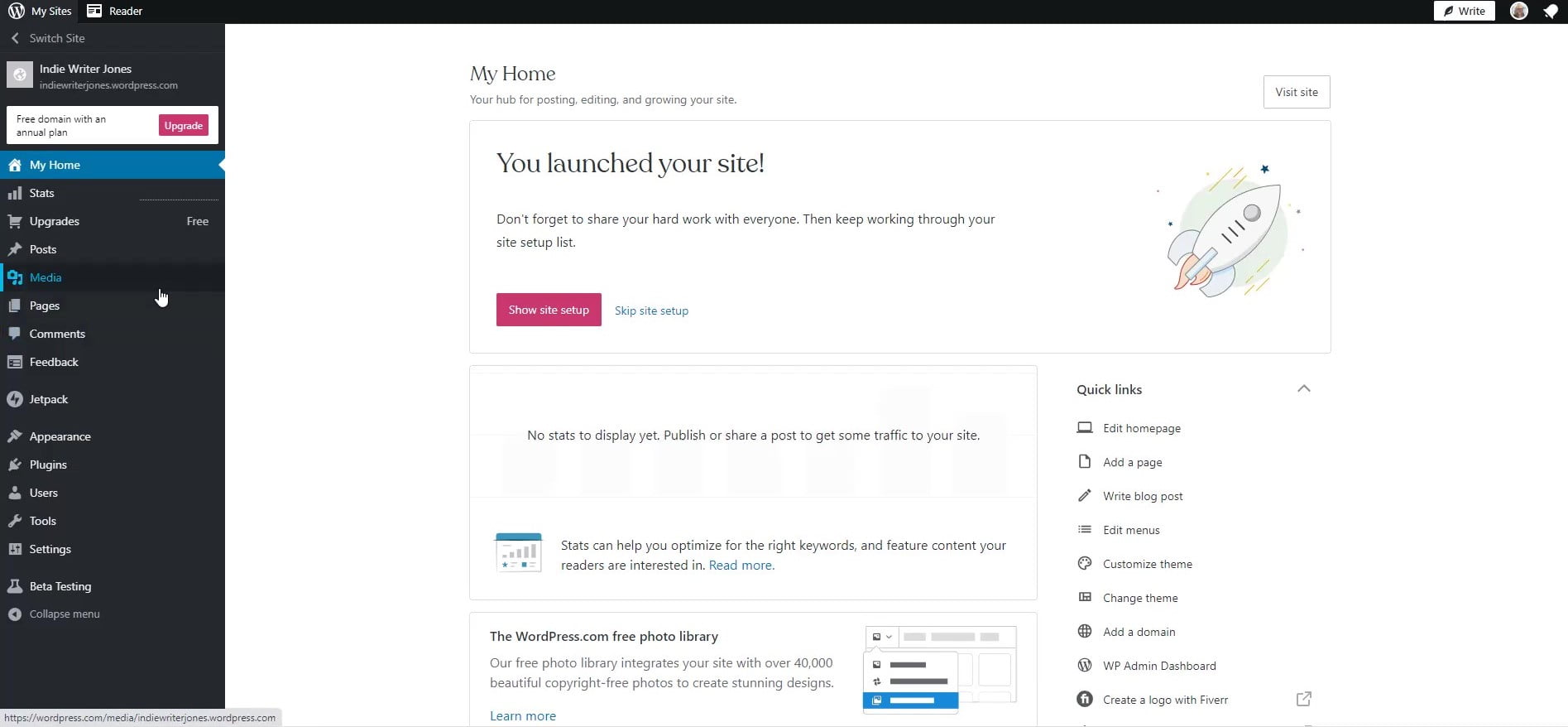
Bookmark this page. This is your WordPress.com site administration screen. If you ever get lost, just come back here.
The URL should look something like this:
https://wordpress.com/pages/indiewriterjones.wordpress.com
Yes, you now officially have a website. But it’s a sucky one. Let’s make it cool.
Choose your theme
The left-hand panel, the one with white text on a dark gray background, is your admin panel. About two-third of the way down you’ll see the word “Appearance.” Hover your mouse over it, and select “Themes” from the drop-down menu.
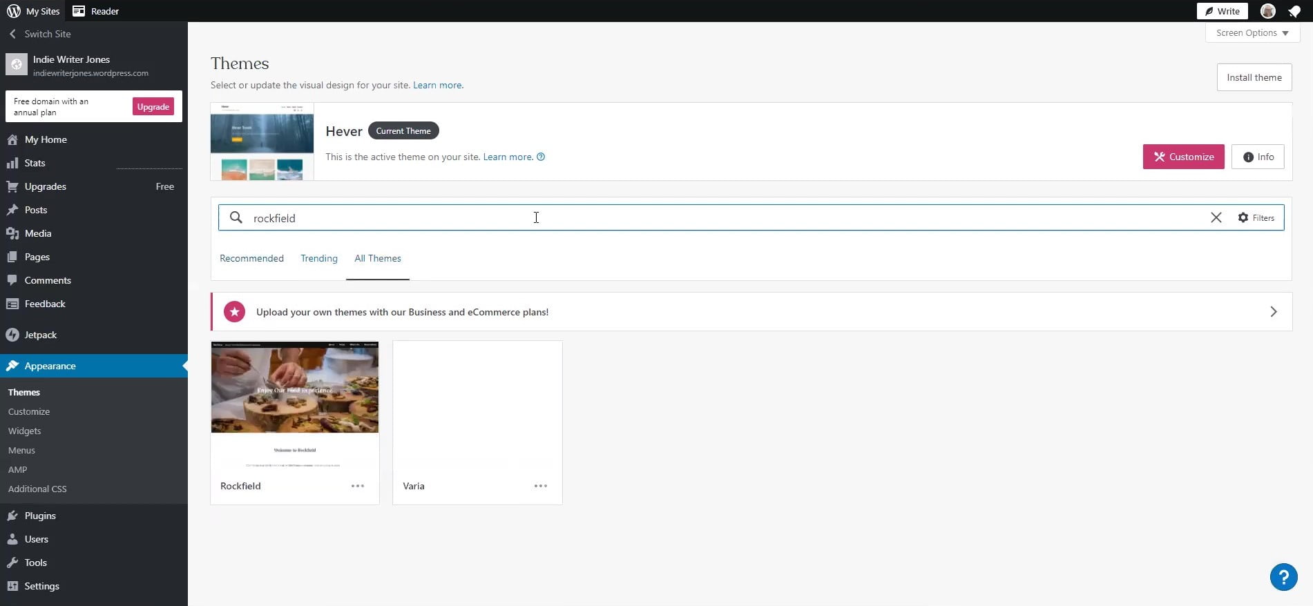
Type “rockfield” into the search box then click on the “Rockfield” theme options.
Then click on the pink “Activate Rockfield” button.
Congratulations, you now have a theme.
If you click on the big “W” at the top left of the screen, you should be able to get back to your admin panel. When I clicked on it I got “< View Pages” as one of the options. I clicked on that, and it took me back to the start.
Upload all your graphics
Remember all the graphics you created in the previous tutorial?
This is where you upload them to the site.
In your admin panel, go to “Media” — it’s about a third of the way down — and then “Add new.” You’ll get an uploader window. I opened the folder where I saved all those images files, selected them all, and uploaded them.
If you have a lot of files, it might take a couple of minutes. I didn’t want to wait, so I opened another window to the main admin screen and continued with the next step.
Set up your menus
In my video, I set up the menus as one of the last steps.
But you’ll save some time if you do it first because you can have it add your pages automatically to the menu as you create them. I forgot, so I had to manually add all my new pages.
Don’t be like me.
On your admin page, go to “Appearance” and click on “Menus.” Then choose the “Primary” menu — that’s the one across the very top of the screen.
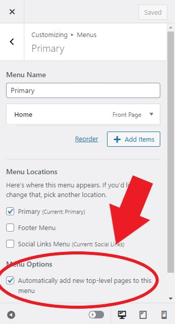
You’ll see the panel above to the left of your home page of your site.
Under “Menu Options” click on “Automatically add new top-level pages to this menu.” Then click on “Save Changes” at the top right of the panel and hit the back arrow to go to the main Menu Options panel.
And while you’re in the menu options, why not set up your social menu?
Click on “Create New Menu,” enter “Social Links” in the Menu Name field, check the “Social Links Menu” under Menu Locations, and click “Next.”
Then click on “Add items,” select the “Custom Links” option and enter your Twitter URL and the word “Twitter” in the Link Text field and click “Add to Menu.”
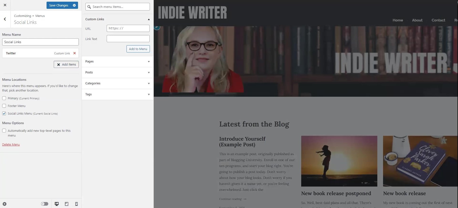
Do the same for Facebook and your other social media platforms. Then click on the blue “Save Changes” button at the top.
This will place your social links at the very bottom of each page, right above the copyright footer. It will show the social media icons for them, too. I personally don’t like the location of the social links in this theme, but that’s the only quibble I’ve got with it.
Meanwhile, you can, if you want, also add your social links to the primary menu the same way as Custom Links — they just won’t automatically be changed into symbols.
You can also add any other links you’d like to either the primary or social links menus. And by dragging the menu items around, you can nest items under other items.
On my demo site, if you hover over the “Books” menu you’ll see a pop-menu with “The Tattered Newspaper.”
When you’re done fiddling with your menus, hit the “X” at the top left to go back to your admin panel.
Create your pages
Back on the admin screen, hover over “Pages” and click on “Add New.”
It gives you a bunch of cool designs to start with, and you can play around with them later, but let’s go with simple and start with a blank page. It’s the first option on the left.
Find your notes for the text you want to have on your website and add it. You can just cut-and-paste into the title and text areas.
I’m talking about the notes you created in the previous tutorial, where you created all the starting content for your site. You did do that, right? If you forgot, you can just write some stuff from scratch.
Let’s start with the “about” page.
On this page, you would put “About” or “Biography” in the title area and the text of your bio under it. You can just cut and paste from your notes.
In the snapshot below, I’ve labeled the key parts that we’ve added. There’s the page title, the heading, an image, and a couple of paragraphs. Each of them is a separate “block” — that’s the basic building block of WordPress sites now. Blocks. You can see the list all the blocks on this page in the sidebar on the left. I’ve labeled the little button you click to open that sidebar — it’s the three horizontal lines in a staircase.
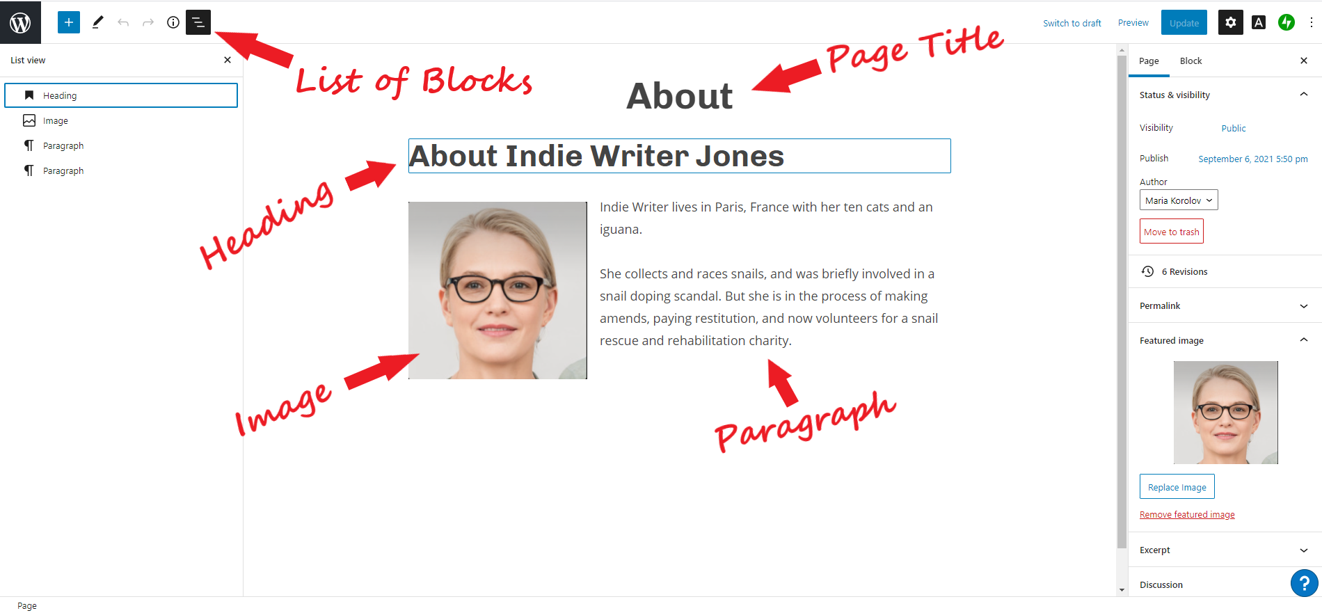
The tricky part is adding a new block. It took me quite a bit of frustration before I figured out how to do this the first time I used this new interface.
For example, I want to add an image. WordPress calls this a “block.”
To add an image, put your cursor where you want the image to go. Then click on the blue square with the white plus sign in it on the top left of the screen, next to the big WordPress “W.”
A panel will appear on the left-hand side with all the cool little gadgets — blocks — you can add. You can add headings, lists, pull quotes, tables… look down to the “Media” section near the bottom. That’s your graphics options.
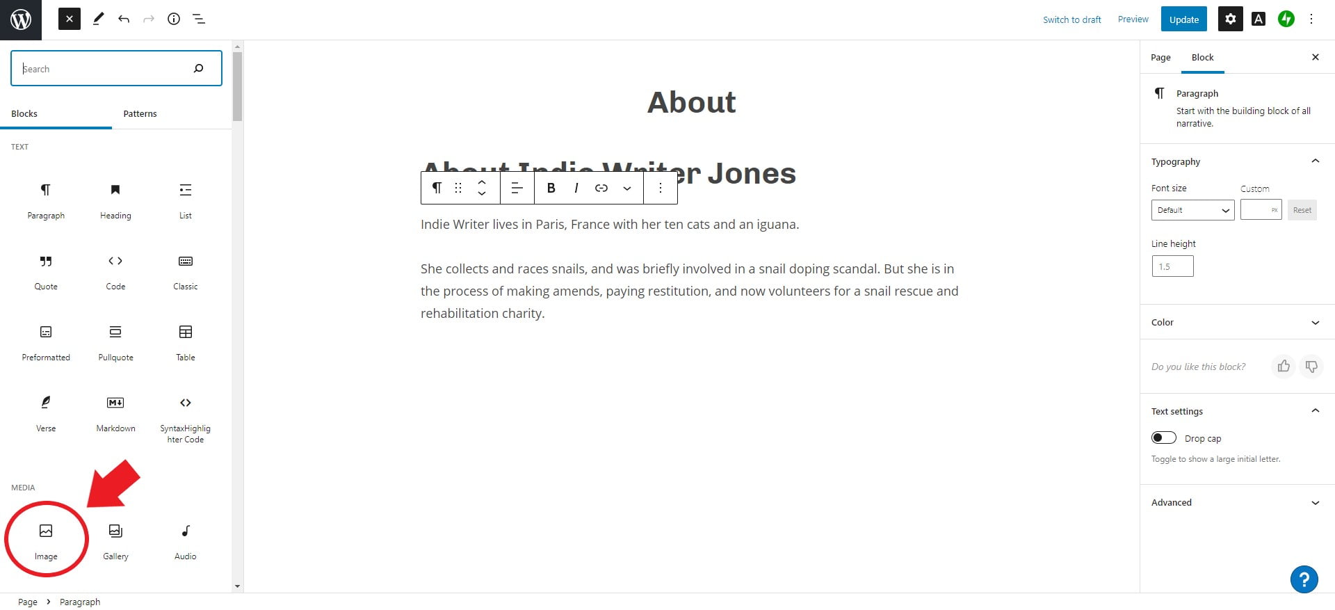
Click on “Image” and you’ll get an image dialog box. Click on “Select Image” then “Media Library”, then choose the headshot you’ve uploaded a few minutes ago with all your other images. Then click the purple “Insert” button.
You’ll get the image pasted into the body of your text where your cursor was. Click on the image, then the little alignment button that pops up in the control panel over it. The alignment button is circled in red in the snapshot below — it’s the three horizontal lines, where the middle one is thicker than the other two.

The first option is “Align left.” Click on that. Now the text will flow to the right around the image.
Also, see the little circles on the right and bottom edges of the image? Click and hold your mouse down on one and move it to change the image’s size.
And if you click right under the image, in the “Add caption” area, you can add a caption.
You can play around with the page, adding more content and graphics. If you’ve ever used WordPress before, this new interface is a little tricky and not particularly user-friendly. Hopefully, over time, they’ll streamline it a little more. I’m getting used to it.
And it’s worth it. It gets easier with practice, and the benefits are astounding. Really, I swear. It’s totally worth it.
I urge you to play around with the other buttons next to the alignment button. You can add text on top of the image, for example, or make it a link, or crop it, or apply a duotone filter. Not sure why you’d want to, but hey, it’s there. The second button on the little pop-up control panel — the six dots — let you drag the picture around the page. Meanwhile, you might notice that a panel on the right has appeared, too, with a bunch more image formatting options. You can make the corners rounded, for example.
Okay, you’re back.
In the right-hand panel, you’ll see some options. Under the blue “Publish” button there’s a tab marked “Page” and a tab marked “Block.” Click on the “Page” tab to see settings for the whole page. (The “Block” tab shows you the customization options for the particular block your cursor is in.)
Near the bottom of the panel — you might have to scroll — you’ll find the “Featured Image” section. Click on “Select featured image” and choose “Media Library.” Pick an image to be the featured image for the page. The featured image shows up on archives and search pages and you can also show it on the home page, to showcase particular pages and posts.
I think we’re done with this page. Click the “Publish” button on the top right. It will ask you to confirm. Do that. You’ve now got your first page done. You’ll see an option to add a new page, or you can go back to your admin screen and add a new page from there.
Now go through the same process for other pages you want. In my video, I added a contact page, some testimonials, and some reviews. All fake, of course. Indie Writer Jones is a bad, bad, bad girl.
Create your posts
I recommend creating at least a couple of posts, preferably more, so that you can set up the way your posts will look on your home page.
You can write posts about book announcements, your thoughts on the day, reviews of books you’ve read or movies you watched lately, links to interesting things you’ve seen on the Web, or cute pictures of your cats.
To add new posts, go back to your admin page and then under “Posts,” click on “Add New.” Then paste in the title and body text the same way you would for a page, add your featured image, and hit “Publish.”
I back-dated my posts. Under the blue “Publish” button there are two tabs — “Post” and “Block.” Click on “Post” to bring up the post settings. In the “Status & visibility” section there’s a line that says “Publish Immediately” with the word “Immediately” in blue. Click on that word and it will let you change the date on which the post is published. You can change it to some time in the past, to make it look like your site is older than it is, or you can schedule your post to be published some time in the future.
One you’ve added all your posts, it’s time to start designing your site.
Set up your logo
Back on the admin screen, about two-thirds of the way down the gray left-hand panel, there’s an “Appearance” item. Mouse over that and click on “Customize.”
Then click on the first item, “Site Identity.”
There, click inside the “Select Logo” box and select the logo you previously uploaded from the media library.
It suggests an image size of 100 by 96 pixels. Mine is wider than that, which is fine. It will be a little hard to see, though — the image will be white text on a light gray background.
![]()
Click on your logo image, then the “Select” button at the bottom right. It will ask you to crop the image. Click on “Skip cropping” instead.
Back on the Customizing panel, you should now see the new logo at the top of your sample page.
In the panel on the left, under “Site Title” and “Tagline” you’ll see a box marked “Display Site Title and Tagline.” Uncheck that. You want to show your new logo instead of the site title.
In the future, you can come back to this section if you want to create an icon for your site — that tiny little square that’s up in your browser tab next to the site name. You might want to get a little icon to use there, like your first initial, or a little spaceship icon. It has to be something easily visible when scaled down to a tiny little square.
But I skipped this part.
Many sites don’t have one, anyway.
Hit the blue “Save Changes” button at the top, then the back arrow next to “Customizing Site Identity.”
Set your color theme
In your main Customizing panel, click on “Colors & Backgrounds.”
That will bring you to the color theme selection page. By default, the Rockfield theme will suggest a palette of five colors — white, dark gray, black, light gray, and green.
You can keep that if you want green as the accent color. If you want a different accent color, click on the green circle and you can choose a new color. You can either pick one of their suggestions, or use the color picker to find a different one, or cut-and-paste your color HTML code in the field under the big colorful box with the rainbow bar next to it.
I picked orange.
Click on “Save Changes” and go back to the main Customizing panel.
Set your home page settings
In the main Customizing panel, click on “Homepage Settings.”
Under “Your homepage displays” it should say “A static page.”
Under “Homepage” it should say “Home.”
You don’t care what the Posts page is.
But make sure that “Hide Homepage Title” is checked. That will remove the word “Home” from the top of your home page.
Save your changes and go back.
Set your fonts
The next thing you need to look at in your Customizing panel is the fonts.
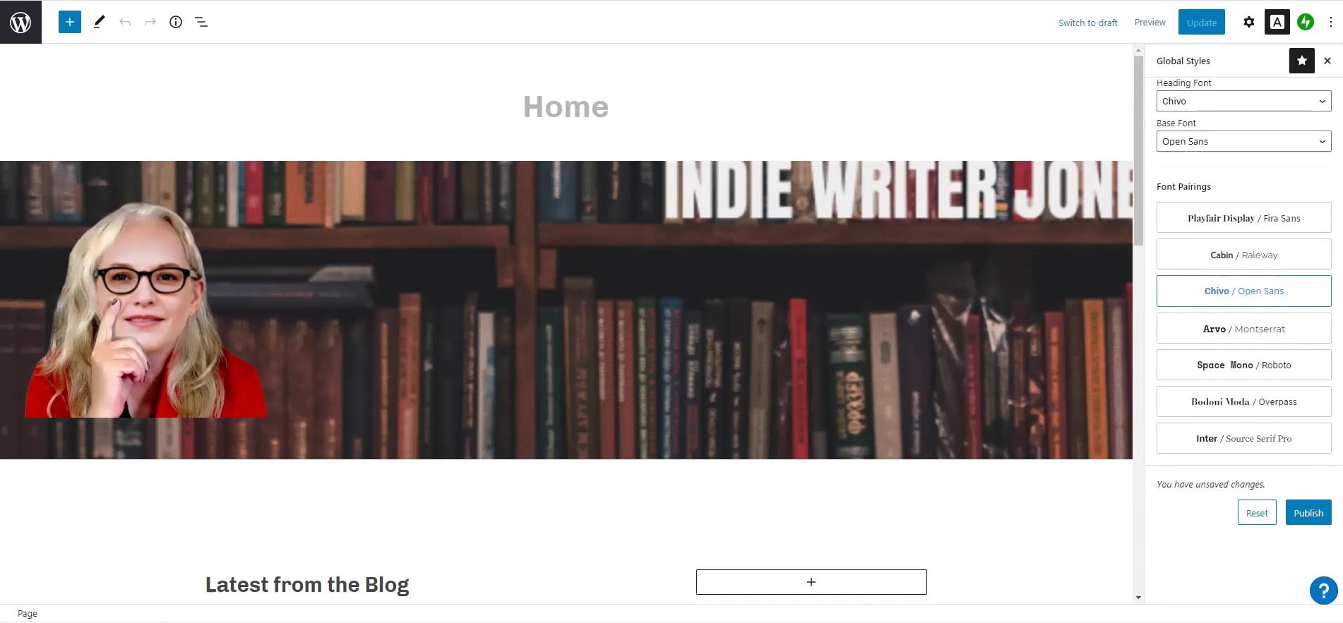
Click on “Fonts”, then click on “Click here to open the Block Editor and change your fonts.” It will take you to a totally different page. Don’t be scared.
On the far right, you’ll see a “Global Styles” panel. There, you can select a heading font and a base font. I used “Chivo” as the heading font and “Open Sans” as the base font.
They also suggest some font pairings that might look nice.
You should have already decided what fonts you’re going to use in the previous tutorial. If you didn’t, go with Chivo and Open Sans.
If you don’t like it, you can always come back here and change it. When you do, the change will be immediately reflected throughout your entire site. Ahh, the miracle of content management systems! In the old days, you’d have to pull up each page individually and manually change the fonts on every block of text. While walking uphill both ways.
Once you’ve picked your fonts, click “Publish” in the bottom right.
And we’re ready to start designing our home page.
Delete stuff you don’t want
The way WordPress’ Gutenberg blocks work is kind of like… nesting Russian dolls. Or Tupperware containers that fit inside other Tupperware containers.
You can add blocks, delete blocks, and change the way individual blocks look and act.
To delete a block, just select a block and hit the backspace key.
Hah! You’d think! Selecting a block is HARD! Maybe they’ll fix this part someday — or maybe I’m just missing something — but it usually takes me a couple of tries to find the right layer of Tupperware. Thank God for the undo key.
To delete a block, I click on the thing I want to get rid of. But now I don’t know which layer of Tupperware I’m actually selecting. Sometimes, I’ll just delete whatever one I’m in because I don’t care, and delete the next one, and the next one until they’re all gone. To delete it, click on the three dots at the far right of the pop-up control bar and then look all the way to the bottom of the pop-up menu to where it says “Remove block.” Oh, hey, you can also hit Shift-Alt-Z. Good to know!
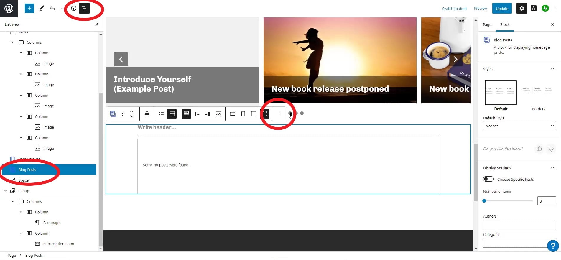
In the image above, I circled three areas in red.
I want to delete the section that says “Sorry, no posts were found.” So I clicked inside that box, and the tool bar popped up above it. I circled the three dots at the right of the tool bar — that’s the drop-down menu with the “Remove block” option at the bottom.
That will remove that immediate block. Then you’ll be in the block that contains it, and you can do the same thing to remove that block, too.
Or you can click on the little thingy at the top left of the whole screen. I’ve circled it — you’ve got the big “W” that takes you back to the WordPress admin screen, the blue plus button that lets you add a new block, the edit button, the undo and redo buttons, an info button, and then a staircase-style button. That one shows you a list of all the blocks — and you can see how some blocks are nested inside other blocks. You can choose a block from the list — the one that’s highlighted is the one your cursor is in — and then hit the backspace key to delete it.
Adding stuff
In my demo video, I added a few panels. I’m not going to go through them too deeply here; I’ll do separate tutorials on each of these later.
But let’s do a quick couple of them.
The default page has a blue picture of mountains at the top of the page, with the words “Welcome to your new site” on it.
I clicked on the mountains — not the text, but the mountains around it — that selected the “cover” block.
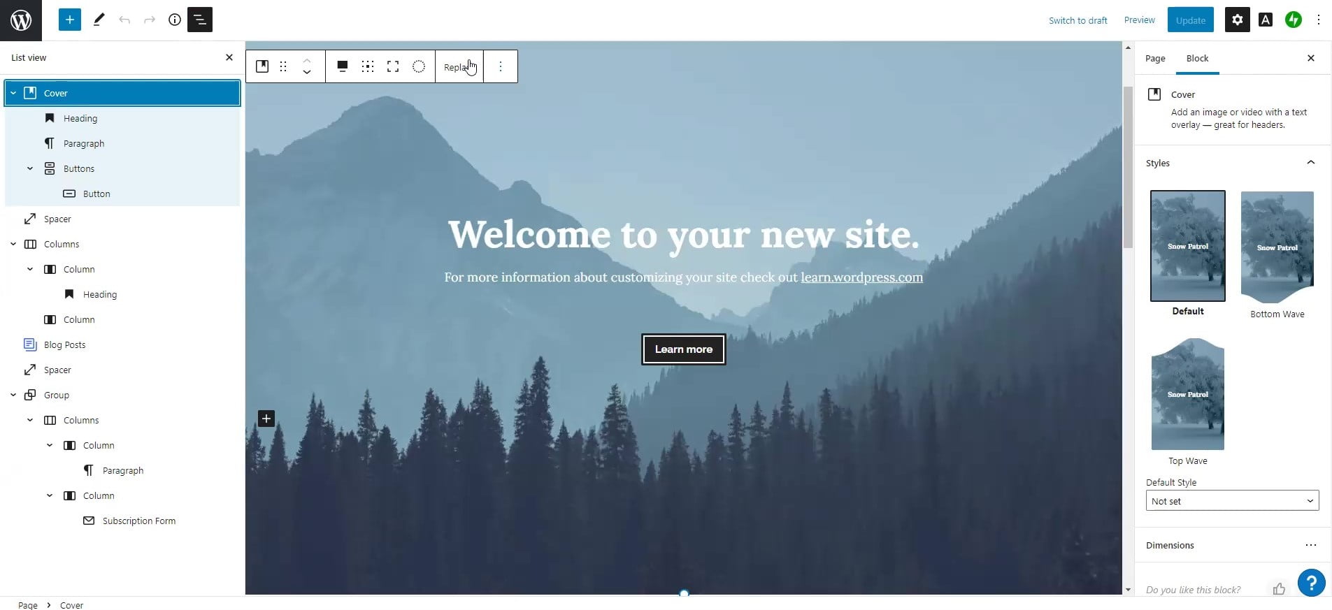
In Gutenberg blocks a “cover” is an image that sits behind other stuff.
In the screenshot above, you can see the left-hand sidebar shows the word “Cover” then, under it, you’ve got a “Heading” block, a “Paragraph” block, a “Buttons” block and, inside the “Buttons” block, you’ve got a “Button.” Keep an eye on that sidebar. It shows you where you are and what you’re working on.
And yes, it feels complicated and awkward. It does get easier once you’ve done it a few times and developed some muscle memory. It’s just a new way to think about layout and design. Once you get it, things will start making sense.
Anyway, I want a different cover image. So I hit the “replace” button in the control bar that popped up at the top of the block and selected a new image from the media library, one of the ones I uploaded previously. The one with a bookshelf and the words “Indie Writer Jones” on it.
I deleted the extra text — and the button — then clicked that blue plus at the top left and selected “Image” as the block type I wanted to add. Then I selected the image of the randomly generated blonde lady and added her in. Now the lady is floating somewhere in the middle of the cover image. I clicked on her, then clicked on a square composed of nine dots. That lets you position the new image anywhere on top of the cover image. I picked the bottom left corner.
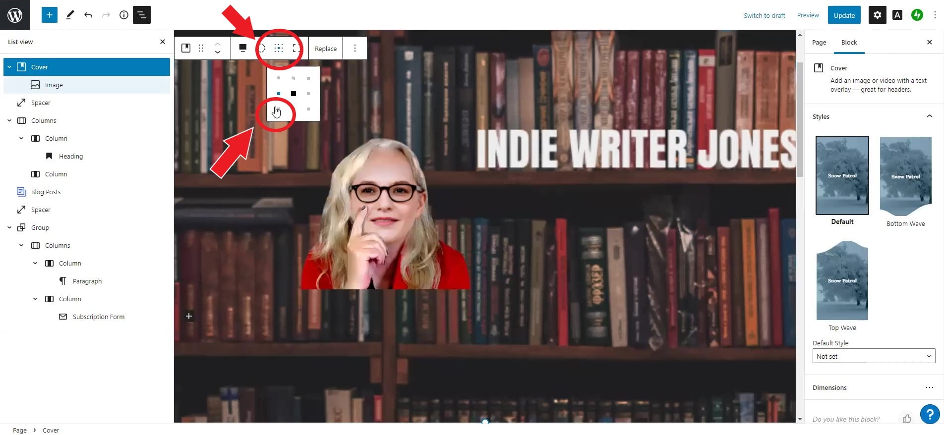
Now I’ve got a floating lady on top of a bookshelf.
Adding a row of books
Lets do one more panel before I turn in for the night: adding a row of books.
The easiest way I’ve found to add new panels is to click on a panel above or below where I want the new one.
Then use the left-hand sidebar to pick the outer-most block in it. So, say, if I wanted to put my row of books under the panel with the floating lady in it, I’d be sure that I was selecting the “Cover” block that she was in.
Then I click on the three dots at the far left of the pop-up horizontal toolbar and click on “Insert after.” Then choose “Cover” again as the block type.
Now pick a background image for the row of books. I picked a cloud background.
Now click inside the cover block and click on the blue plus button at the top left and select “Columns” as the new block type.
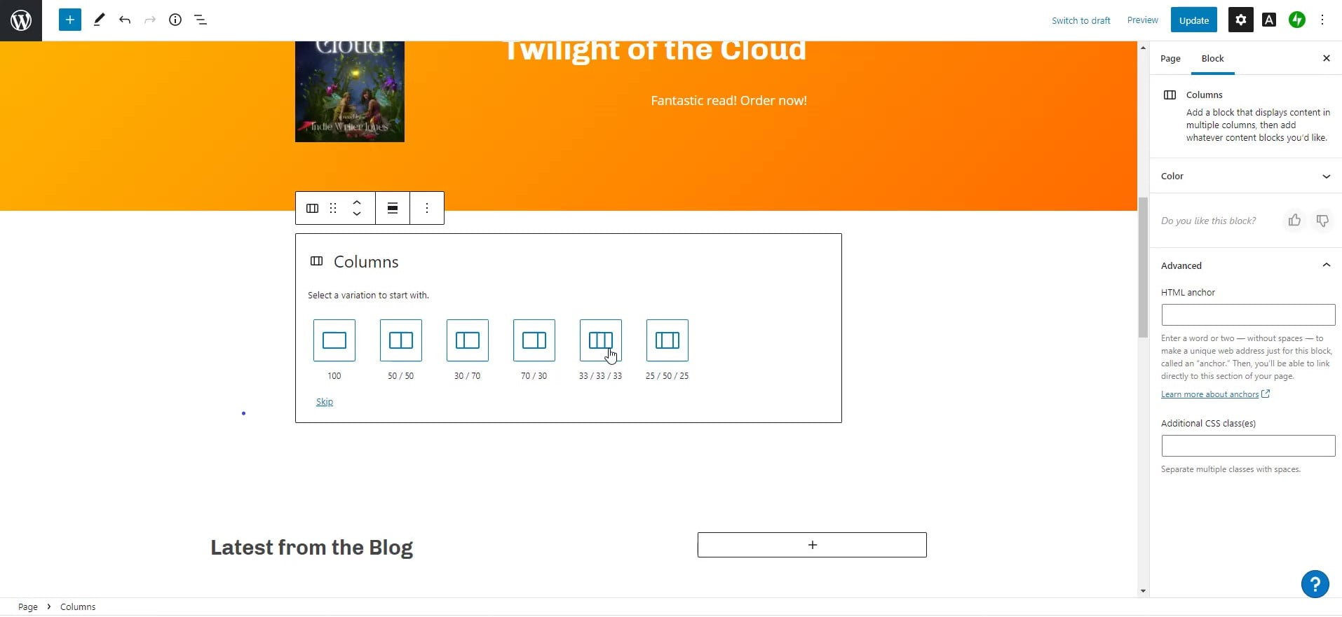
I selected the three equal columns — you’ll be able to change the number and width of the columns later, if you want.
Then I clicked on each column in turn and added an “Image” block — a book cover.
If you want the panel to go the full width of the screen, click on the alignment icon, the one with the three horizontal bars, the middle one fatter than the other two. That’s the one that sets the width of the block. Pick “Full width.”
There you go. Row of books.
Later on, I’ll do a longer article about different ways to create a row of books panel.
The last thing I did was replace the default posts lists with a “Posts Carousel.”
First, I deleted the block that I didn’t want.
Then I added a new “Post Carousel” block. The “Post Carousel” block is far down the list of the blocks you can add when you click the blue plus button. I usually find it faster by searching for it, but if you want to scroll it’s the last item in the “Widgets” section. I made it full width, then, in the sidebar at the far right, I told it to show three slides at once, and to hide the author name and the date. You can play around with all these options to make the “Post Carousel” show different-sized images, or to select out just the posts with a particular author, tag, or category. So, for example, you can label some posts with the “Books” category and show them in a books carousel, and label other posts with a “Short stories” category and show them in a short stories carousel.
I’m going to be going through all these options in later tutorials in greater depth.
Meanwhile, you can watch the full video below.

Edited by Melody Friedenthal

MetaStellar editor and publisher Maria Korolov is a science fiction novelist, writing stories set in a future virtual world. And, during the day, she is an award-winning freelance technology journalist who covers artificial intelligence, cybersecurity and enterprise virtual reality. See her Amazon author page here and follow her on Twitter, Facebook, or LinkedIn, and check out her latest videos on the Maria Korolov YouTube channel. Email her at [email protected]. She is also the editor and publisher of Hypergrid Business, one of the top global sites covering virtual reality.