
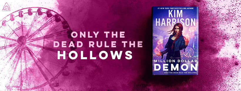
In this article, I’ll explain how to create a common element in author websites: a featured book panel, like this one that Kim Harrison has on her website:
This article is part of my series on website design, focused on free and ultra-low-cost options for book authors. If you haven’t yet, you might want to take a look at the earlier articles in the series:
5 things the best author websites of 2021 have in common — I looked at hundreds of sites by today’s big names in science fiction, fantasy, horror, and other genres and identified the key elements featured today.
Setting up an author website: Before you start — Before you create a website, you’ll need to gather some materials, such as your logo, headshot, bio, book covers, and some other starting content.
Free author website: initial setup — For authors on the lowest budget, zero dollars, I recommend using WordPress.com for your hosting. You can always upgrade to their $4 a month hosting, which includes your own domain, at some point in the future. Most authors will never need anything more than that. In this tutorial, I literally take you through everything you need to do to get your website up, with all the key elements in place, in under an hour.
How to set up a new author website with DreamHost in 15 minutes — For authors who want more advanced capabilities, like plugins, or support for multiple sites, my favorite hosting provider is DreamHost. In this tutorial, I take you through all the steps of setting up a WordPress site on DreamHost. Their “one-click install” is literally a single click — you’ll spend most of your time entering payment information.
Website basics: How to create a row of books — In this tutorial, I go into detail about how to create a common element in author websites: a row of books. There are several ways to do this, and I go through six of the easiest. You can even have cool moving background images and rotating carousels, with the free WordPress.com site, and I show you how.
The featured book panel
Now, onto today’s tutorial.
One key element that nearly all of today’s top author websites have is a featured book panel.
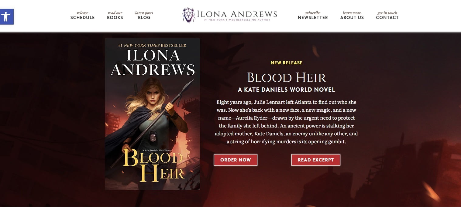
The panel above is from an earlier version of Ilona Andrews’ website.
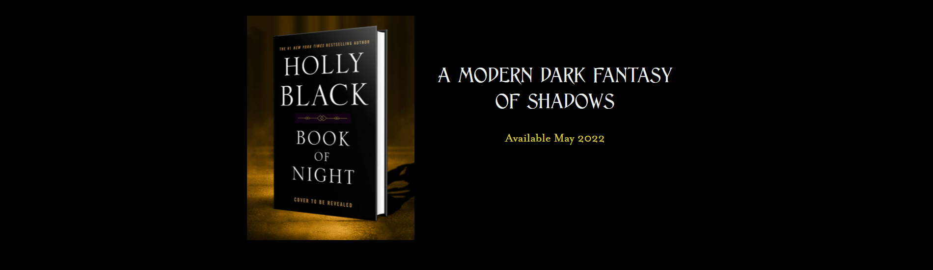
Here’s a panel from Holly Black’s website, promoting an upcoming book release:
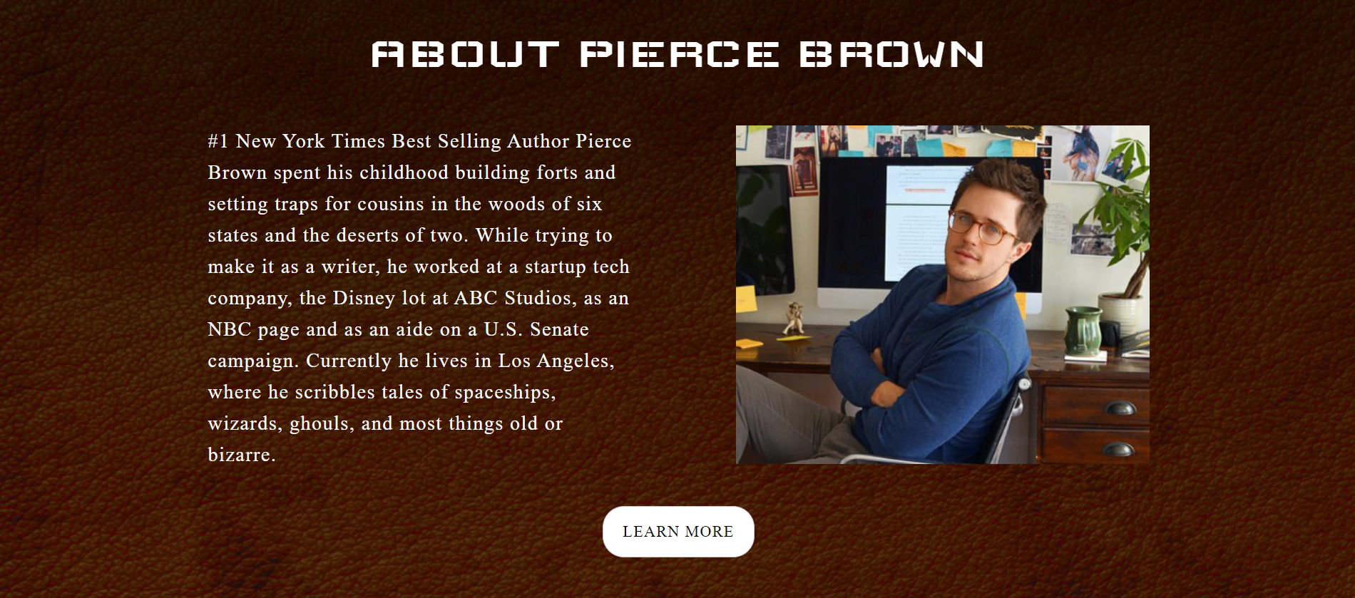
The same kind of featured panel approach can also be used for a short bio.
In the panel below, Pierce Brown provides a little info about himself, then links to his full biography page for the whole story:
The main elements of featured panels is a background image, the book cover — or an author photo — some text, and a button. That button could be an actual button in the panel, or it could be the whole panel itself.
If you’re working with a website designer, this is where you tell them what kind of image you’d like for the background, the book cover image or perhaps your own photo you’d like to include, what text you want to show, and what you want the button to do.
If you want a cool background image, check out these free-to-use, CC0-licensed background images from Pixabay. When picking a background image, I suggest you pick one that’s not too busy, and that contrasts well with your book cover. If your book cover is light, choose a dark background image. If your book cover is dark, choose a very light background image. If you pick a background image that’s somewhere in the middle, or that has too much going on, it will distract from your main message and make the text hard to read.
In the tutorial below, I’m going to be setting up these panels on my absolutely free WordPress.com-hosted Indie Writer Jones demo site. If you don’t have one yet, you can follow my tutorial on how to set one up here. But you can also create these kinds of panels on any WordPress site, no matter where it’s hosted, if you have Gutenberg blocks enabled.
One note of warning, though. I’ve recently discovered that some one-click installers — including DreamHost’s — can add in a bunch of plugins that are designed to make Gutenberg blocks easier to use. Unfortunately, each of them has a different interface and feature set! So if you want to follow my tutorial below step-by-step you might need to turn off these plugins, at least while you do the tutorial. You can turn them back on later. To turn plugins on or off, click on Plugins>Installed Plugins in the left-hand bar of your WordPress admin page.
You will also need to be sure that you have the Gutenberg blocks editor turned on. You can set it under Settings>Writing — either set “Allow users to switch editors” to “Yes” or set “Default editor for all users” to “Block editor” (or both).
All right. Let’s get started.
Full-width single image featured panel
The single easiest way to create a featured book panel is to use one single image the size that you want your panel to be.
Some designers will call this “marketing materials” — for example, the cover design firm MiblArt has some featured book panels in their marketing materials portfolio.
Let’s check out some other author websites to see some examples of featured book panels that use a single image for the panel.
Here’s JD Robb‘s feature panel for her latest book:
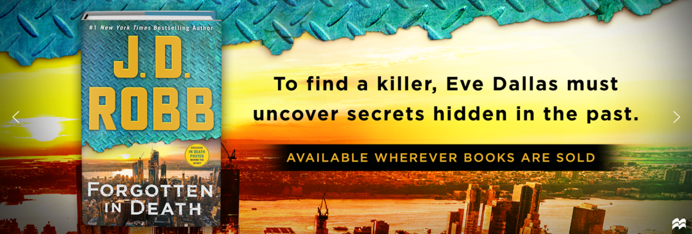
The whole image, when clicked, takes you to the book’s page.
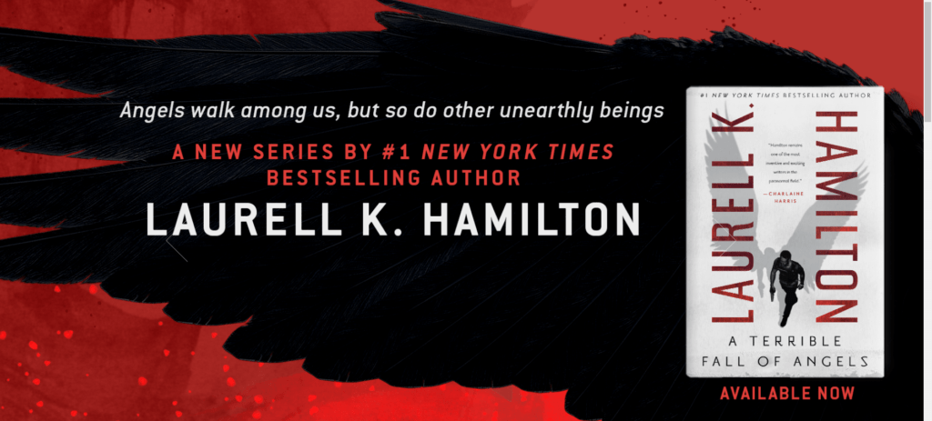
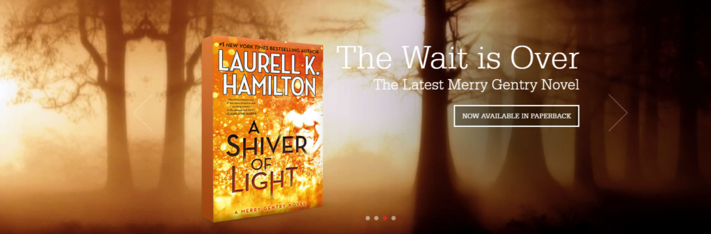
Here’s a panel from Laurell Hamilton’s website:
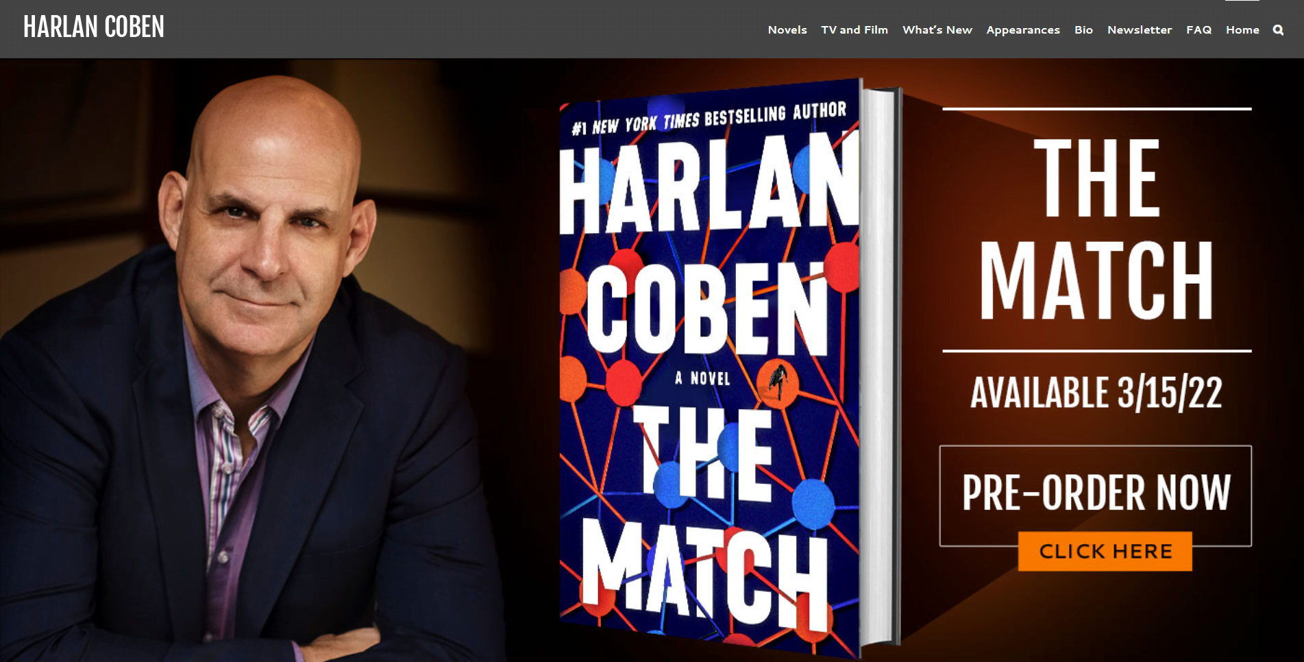
Here is Harlan Coben‘s featured panel, also a single clickable image:
We can do this kind of panel pretty easily. Just create an image with all the fancy graphics and put a link on that whole image to the Amazon site where people can buy your book — or link to an internal page on your website where you have all the book information and all the stores where people can buy it.
If you don’t have a designer to create this panel for you, or your budget doesn’t allow for one, you can create a free panel image in Canva.com.
Their LinkedIn banner templates and their Twitter Header templates are good ones to start with to get a wide panel. Their Facebook cover templates , their Banner templates, their YouTube Channel Art templates, their Twitter Post templates are a bit deeper,
I recommend starting with a template that’s the closest match to the featured book panel of an author website that you admire. Pay attention to the pricing — Canva has both paid and free templates on the site.
Then upload your book cover and any other images you want in it, play with the template’s text and colors, and there you go. Depending on your graphic design abilities you will have at least some kind of cover image.
Sci-fi and fantasy author Derek Murphy has some free templates on his CreativIndie website that use Google Slides. He also has a free online book mockup tool to make 3D book covers that is really cool.
Personally, I think Canva’s default designs are really ugly, and I usually start with a blank image of the size I want. So, for example, if I want to create something like Harlan Coben’s image, I’ll start with a size 1400 pixels wide by 672 high.
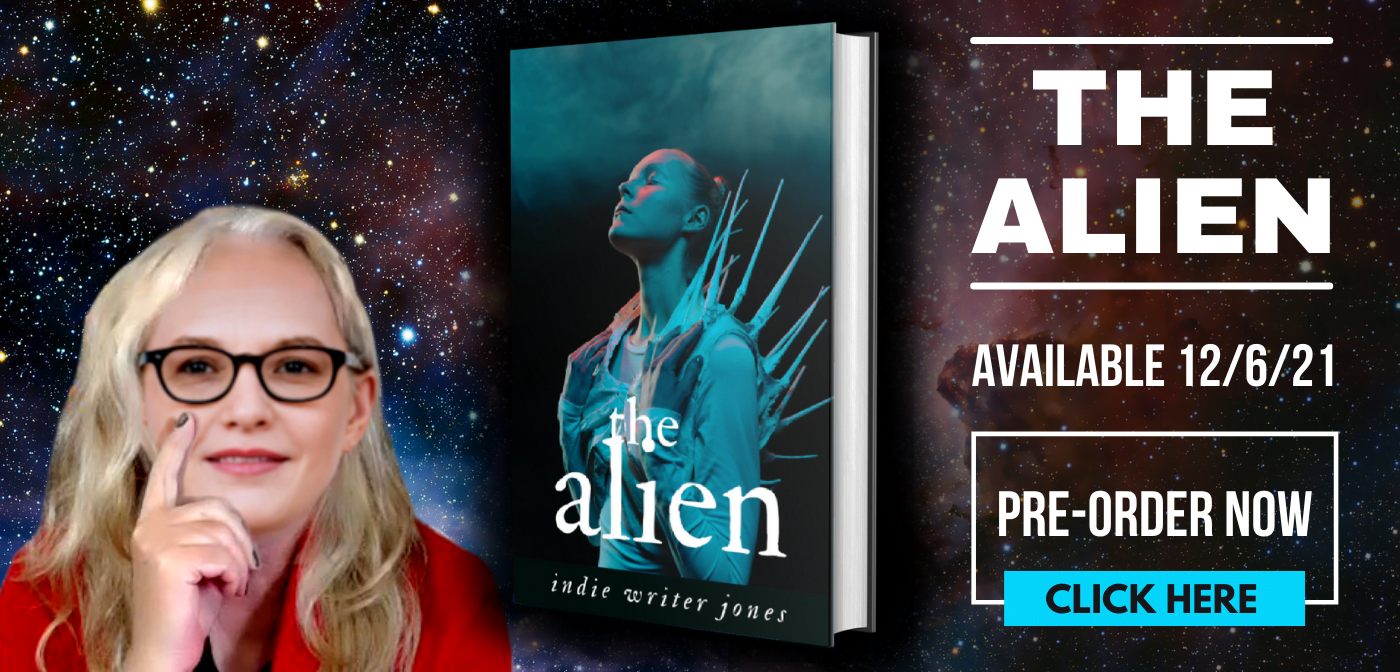
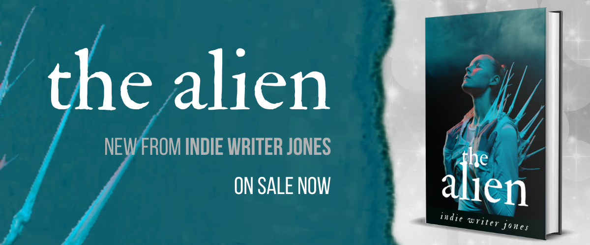
I’m going to create a 3D mockup with Murphy’s mockup tool, grab my fake author headshot, and pick a nice matching background from Pixabay.
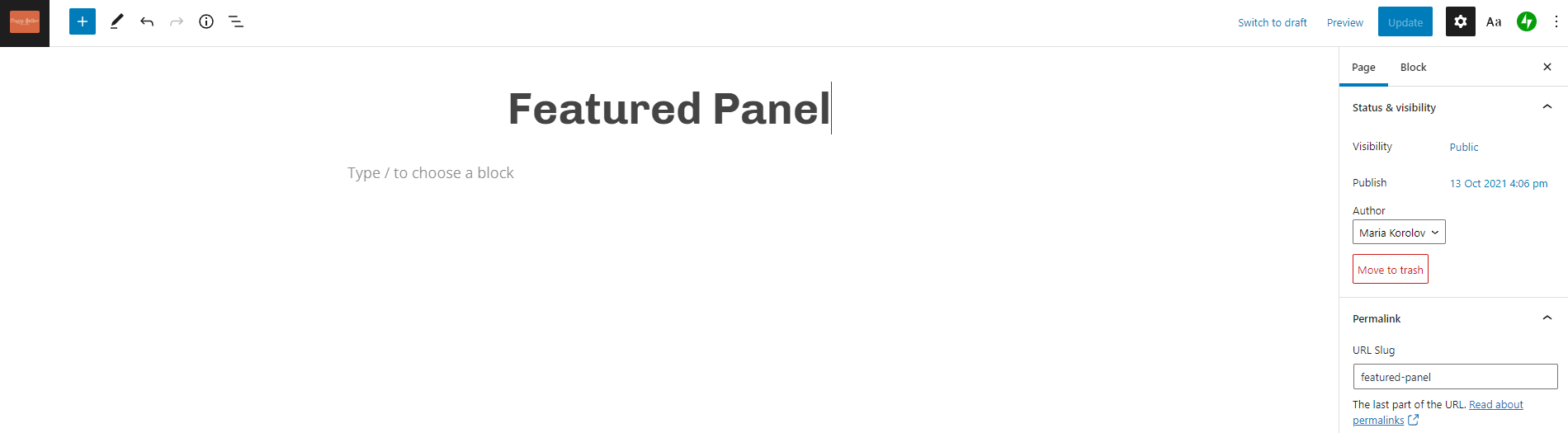
Now I’m going to add the image to my website, using the “Image” block.
I’m going to put it on my “Featured Panel” page but you would have this on your “Home” page.
See that gray text under the page title, where it says “Type / to Choose a block”? That’s where you would type “/image.”
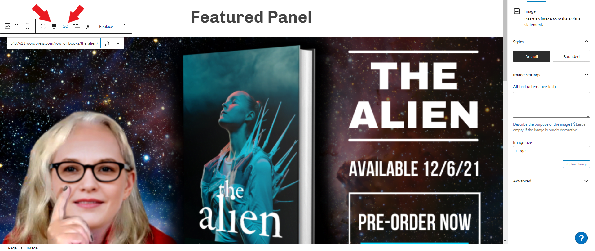
And upload your image. I don’t have an Amazon book page to link it to, since it’s a fake book, so I’m going to link it to the “Alien” book page.
To add a link, click on the “link” icon above the image — it’s the right-hand red arrow in the image below. To make it go the full-width of the page, click on the alignment icon, which the left-hand arrow is pointing to in the image below.
You can see what it looks like on my Featured Panel demo page.
So there you go. The simplest way to add a featured image panel to your website — create a wide image, and upload it.
Here’s another example, from Stephen King’s website:
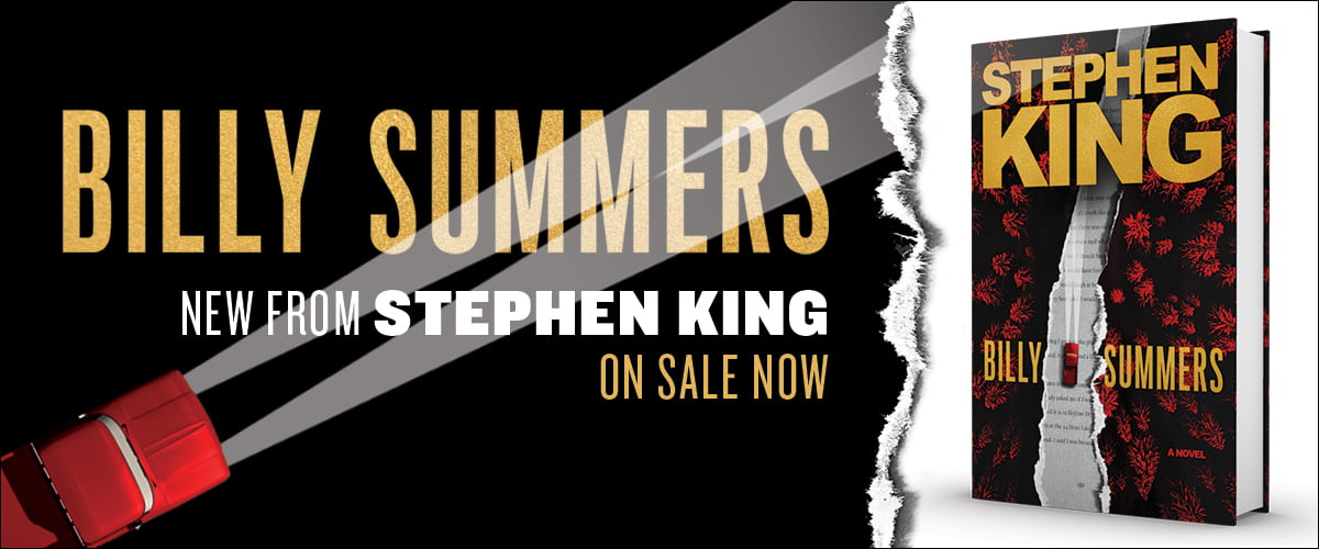
His image is 1200 pixels wide by 500 pixels high.
Let’s see if we can match it in Canva:
The gray-ish background is a free background from Pixabay. The ripped paper was one of the free “ripped paper” images in Canva — I just adjusted the color a little bit to make it darker. The light blue spikes are a copy-and-paste of the spikes from the cover.
Then I just uploaded it to the site by creating a new image block. I made it “wide width” instead of “full width” just for a change of pace and linked it to the Amazon home page.
Now let’s add a layer of complexity.
Image with a button
Brandon Sanderson has a really sexy book promo panel for his new book:
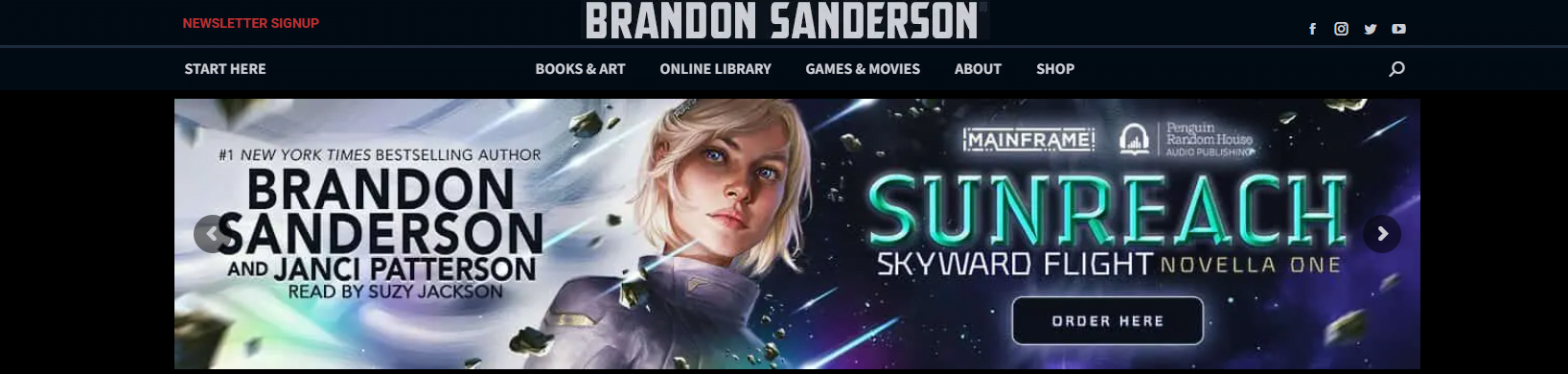
At first glance, it might seem like the same thing we’ve got — but only the actual button is clickable, not the whole image.
Well, we can do that too, by making the image a “Cover” block instead of an “Image” block and putting a “Button” block on it.
First, the image. Again, I’m going to use Canva for this, because it’s free, and doesn’t require any graphics skills. After I log in to my free Canva account, I click on the “Custom size” button and create a new image that’s 1200 pixels wide by 260 pixels high. Why those dimensions? That’s how big Brandon’s image is.
For the cool background, I’m going to click on the “Uploads” button in the far left of of the Canva website and upload my book cover, then stretch and crop until I’ve got just the part of the cover I want, then add a few more Canva elements — some color blocks, some stars, and some text. It’s going to look bad, because I’m not an artist. But hey, you get what you pay for, right?
So here’s my take on it, after ten minutes of playing around:

I’ve left a little space at the bottom right for the button.
Now, back to WordPress.
I’m going to add a new block under my first image block. Again, I scroll to the bottom of the page, look for the gray “Type / to Choose a block” text, click there.
Then I’m going to type “/cover” and upload my new image.
In the new WordPress system, a “cover” is like a background image that you can stick other things on top of.
Then I’m going to click where it tells me to type in the title and instead type “/buttons” and add a button. I’ll call the button “Buy now” and link it to my book page. This time, I’m just going to link to the Amazon home page.
I’ll have a giant square image. I’ll make it full width using the alignment icon in the tool bar that appears just above the image. Then, in the right-hand settings panel, I’ll set it to 0% opacity, and minimum height 260, because that’s the height of my image.
But now the “Buy now” button is off in the wrong place. I want it in the bottom right.
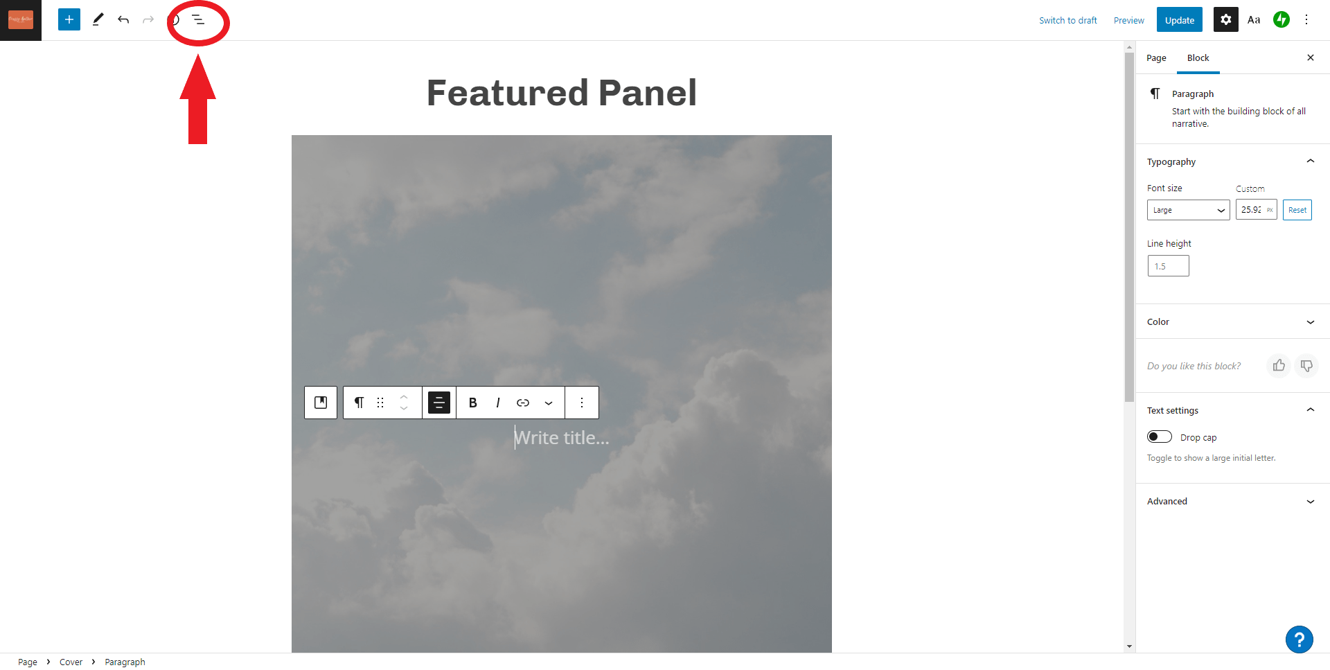
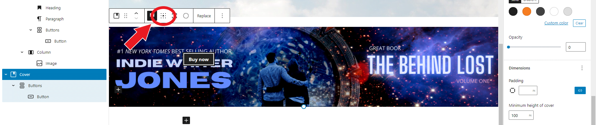 I select the background image block, and a tool bar appears above it. The “Change content position” button, circled in red above, lets you place things in different areas of the cover. It’s those nine dots in a square. Click on that, then choose the bottom right one to place the button at the bottom right.
And how here’s how the new panel looks on my page:
I can also change how the button looks. If I click on it, in the right-hand settings panel I can change the color of the button and the color of the text in it. I can also add some “padding” — empty space around the button — if I want to move it around a little bit. But I’m pretty happy with it the way that it is.
I can even add multiple buttons next to each other, if my book is sold multiple places.
For some more inspiration, here’s another panel from Laurell Hamilton’s website:
You can see that she’s got a single clickable button there.
(She also has these panels in a carousel. We’ll be covering those in a later tutorial.)
But, say I don’t want to use Canva or any other image editing software. I have my book cover, I have a fun background from Pixabay. Isn’t that enough?
Yes! You can use WordPress to put your featured book panel together without having to use any graphics programs at all.
Here’s how.
Using Gutenberg blocks to assemble a featured book panel
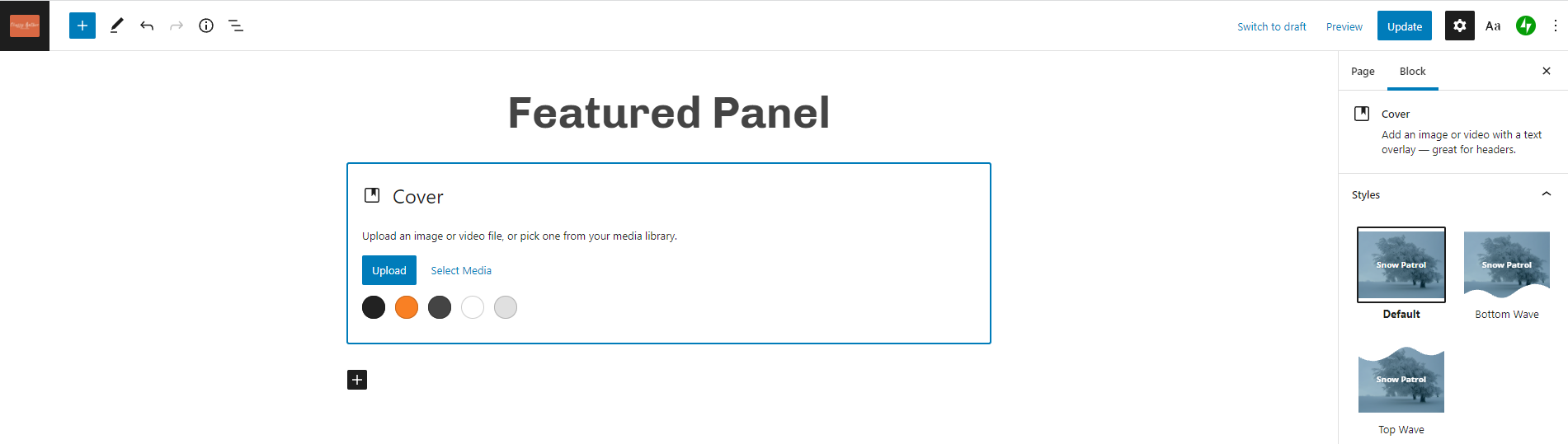
To assemble a panel, we will start with the “Cover” block, like in the example above, but instead of just adding a single button to it, we will add all the elements that you would normally put into a fancy featured image.
To upload the cover, we will layer in an “Image” block, then for the text we’ll use the “Heading” block, the “Columns” block, the “Paragraph” block. Finally, for the button, we’ll use the “Buttons” block.
I’ve actually covered all these elements before, in my post about how to create a row of books. We’re just going to be arranging them a little differently.
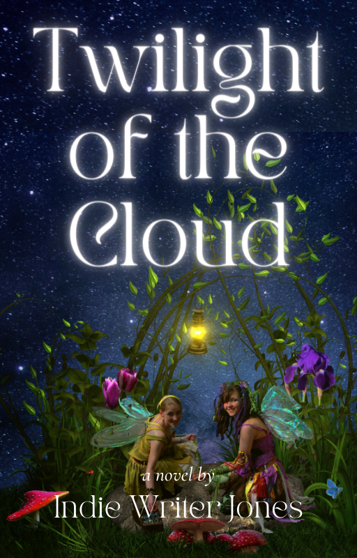
First, let’s choose a background image. I want it to match my book cover, so I’m going to go with a light blue-ish background image. Say, this cloud image from Pixabay:

And here’s the image of the book itself:
Now you can click the blue “Upload” button and upload the file you got from Pixabay. Or you can click on one of the colors and instead of having a background image you’ll just have a solid color. That’s totally fine, too.
I’m going to upload my clouds.
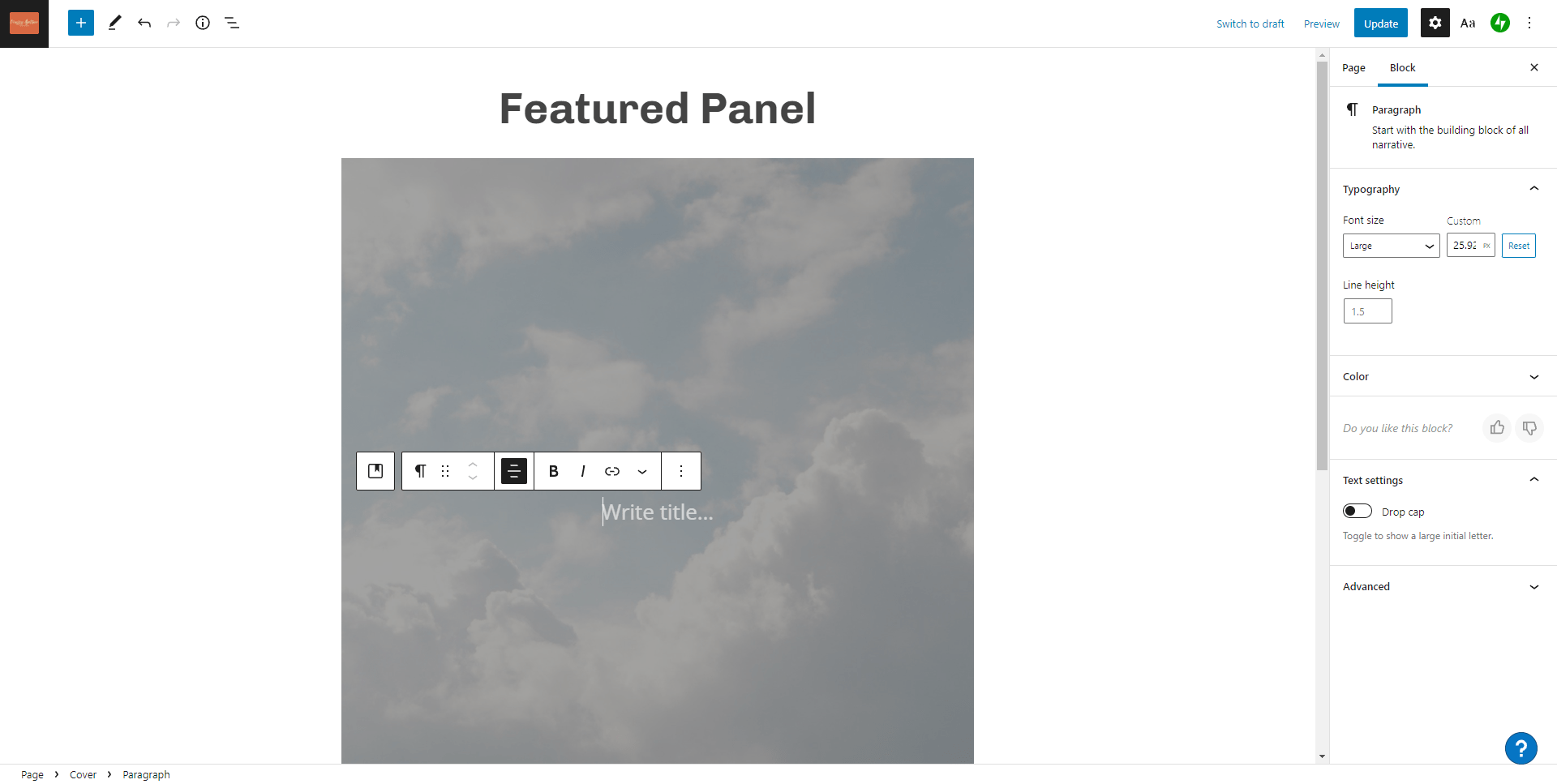
We just added two new blocks — a “Cover” block and, nestled inside it, a “Paragraph” block. If you want to see what the blocks are, you can click on the block list button, circled in red below:
If you click on it, the left-hand sidebar will now show you the list of blocks you have on your page. Here’s mine:
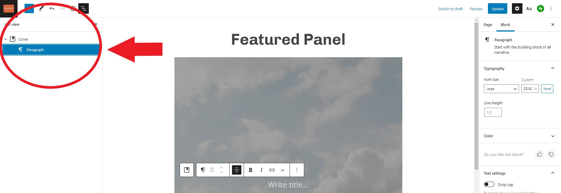
I have a “Cover” block — that the background cloud image — and the “Paragraph” block, which currently has nothing in it, just the “Write title…” gray prompt text.
I’m going to click on “Write title…” and type in “/columns” because I want to put two columns inside my cover — a column that will hold a picture of my book, and a column that will hold my text.
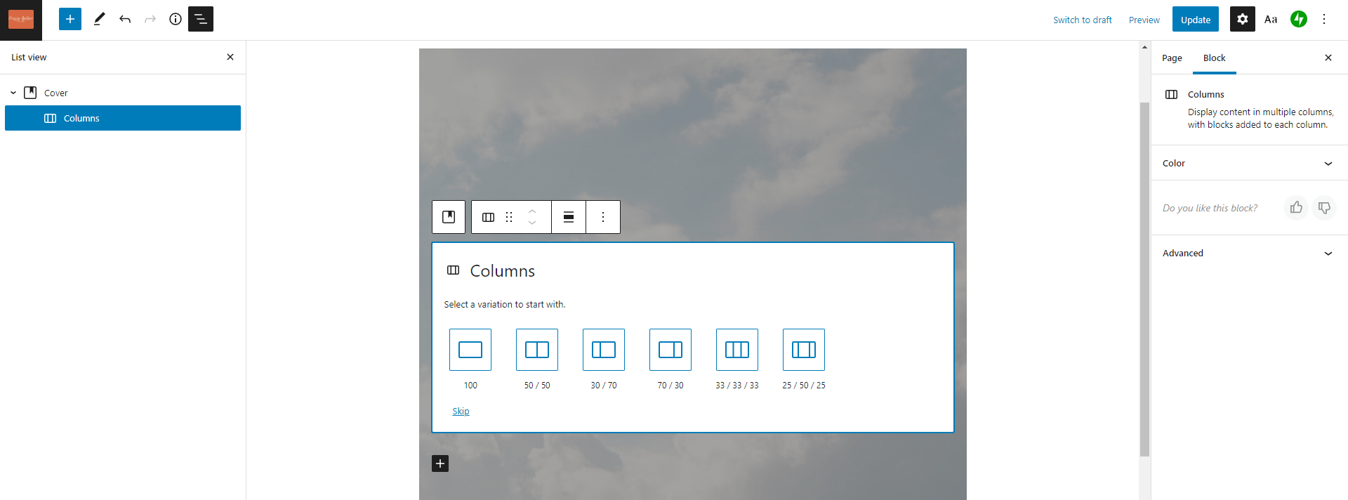
By default, the “Columns” block gives me a few different arrangements. I’m going to pick the “70/30” one. But the “50/50” one or the “30/70” can work as well. You can also change this later if you change your mind.
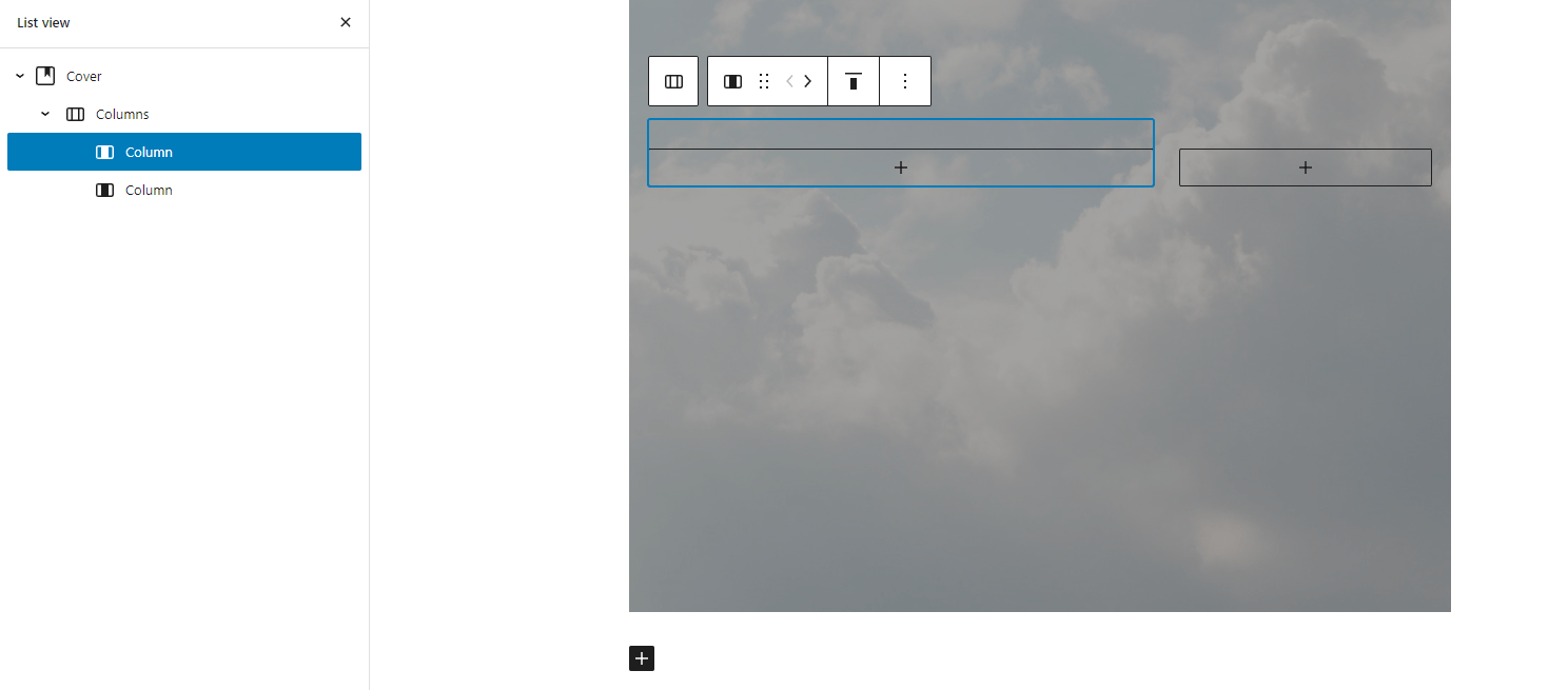
Now my list of blocks in the left-hand panel has changed. I now have four blocks — “Cover,” “Columns”, “Column” and another “Column.” The one selected is highlighted in blue in the left-hand sidebar, but is also outlined in blue in the center of the page.
Do you see the black plus sign in the middle of the first column? I’m going to click on it and type “/heading” then select the “Heading” block from the pop-up list.
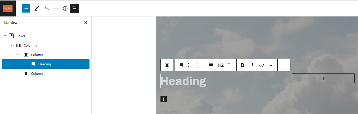
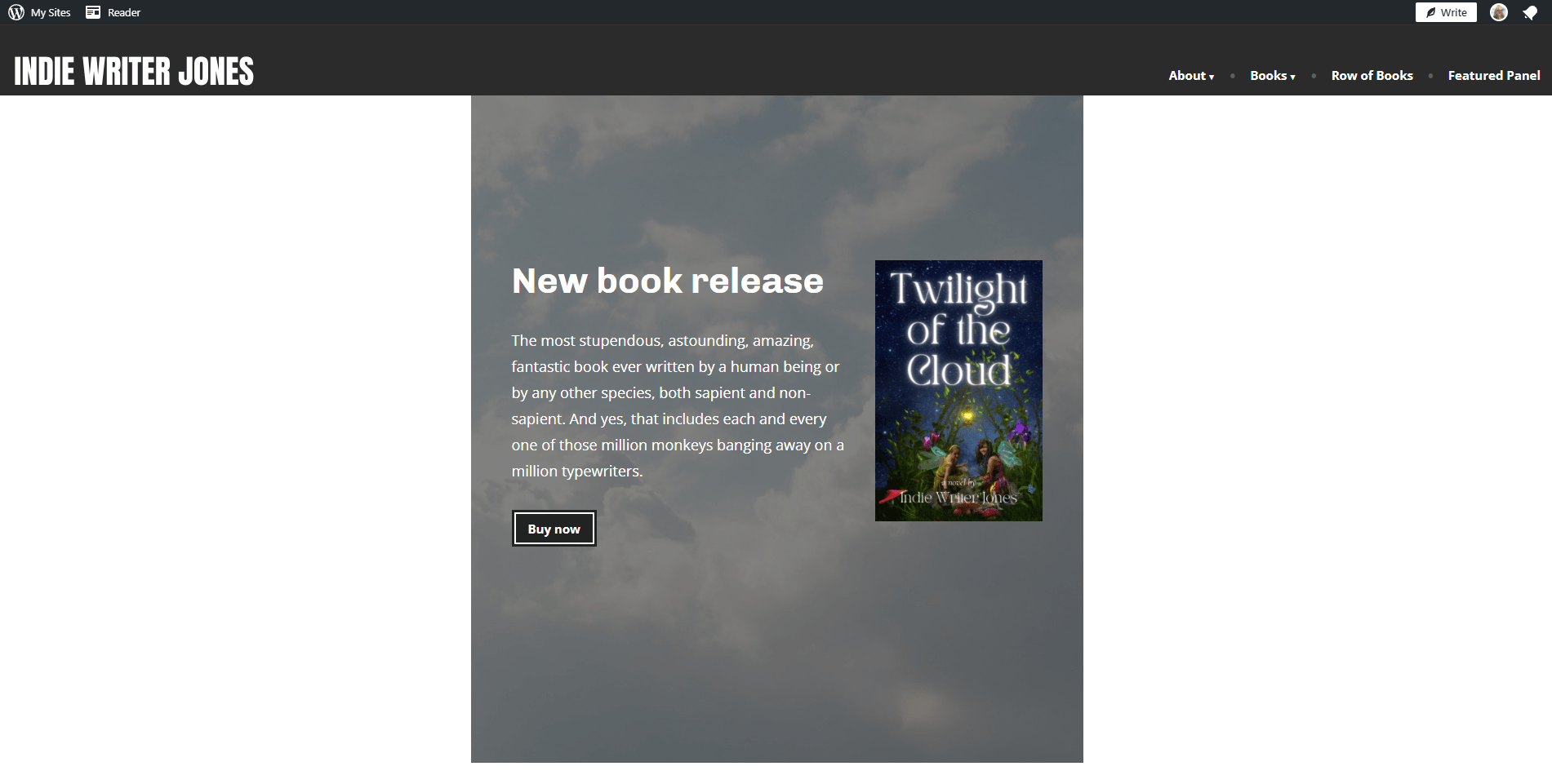
I now have a new “Heading” block inside the first of the two “Column” blocks. I’m going to click on the gray prompt text that says “Heading” and type “New book release” in that spot.
Then I’m going to click on the plus sign in the second column, type “/image” to add an image block, and upload my cover image.
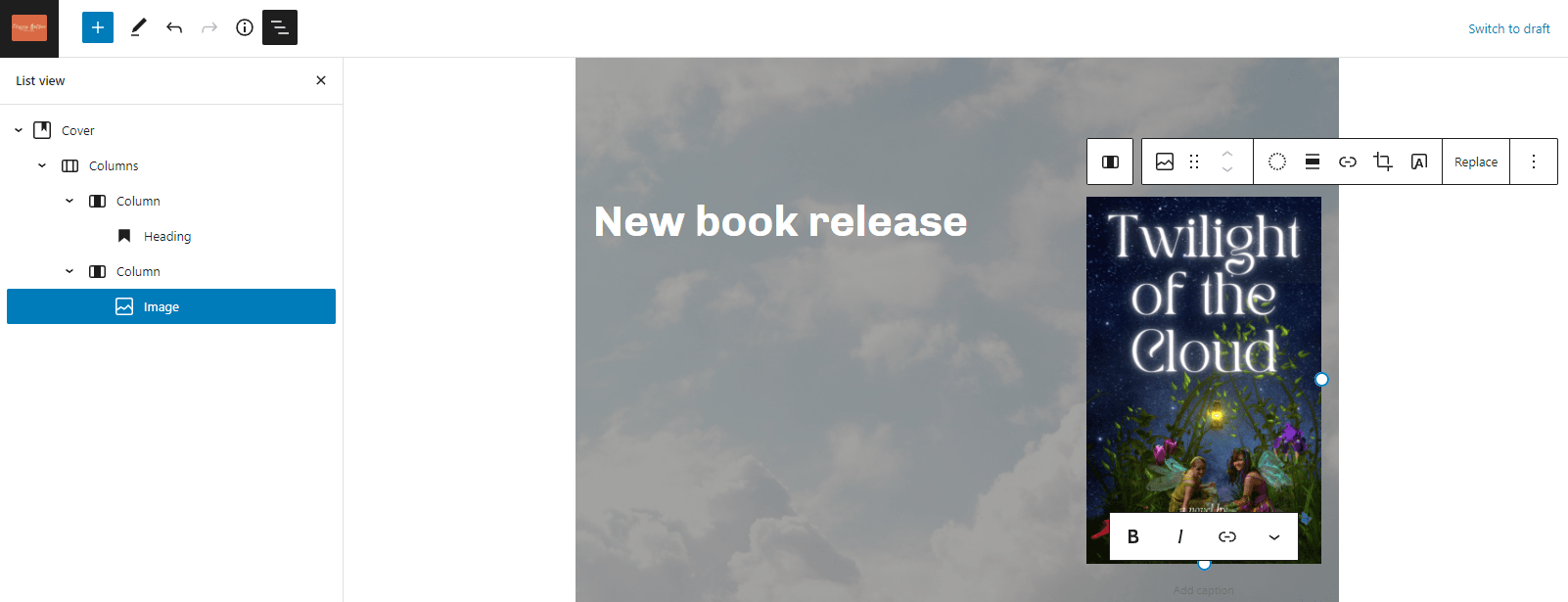
Now let’s add some text under the heading. Plain text is a “Paragraph” block. Easiest way to create one is to click on your heading — put your cursor at the end of the word “release” and click the enter key. That will create a new “Paragraph” block right under it. Then type your text in there.
Under the text, I’m going to want a “Buy now” button. So, after typing my paragraph of promotional text, I’m going to hit enter and then, instead of typing more text, I’ll type “/buttons.”
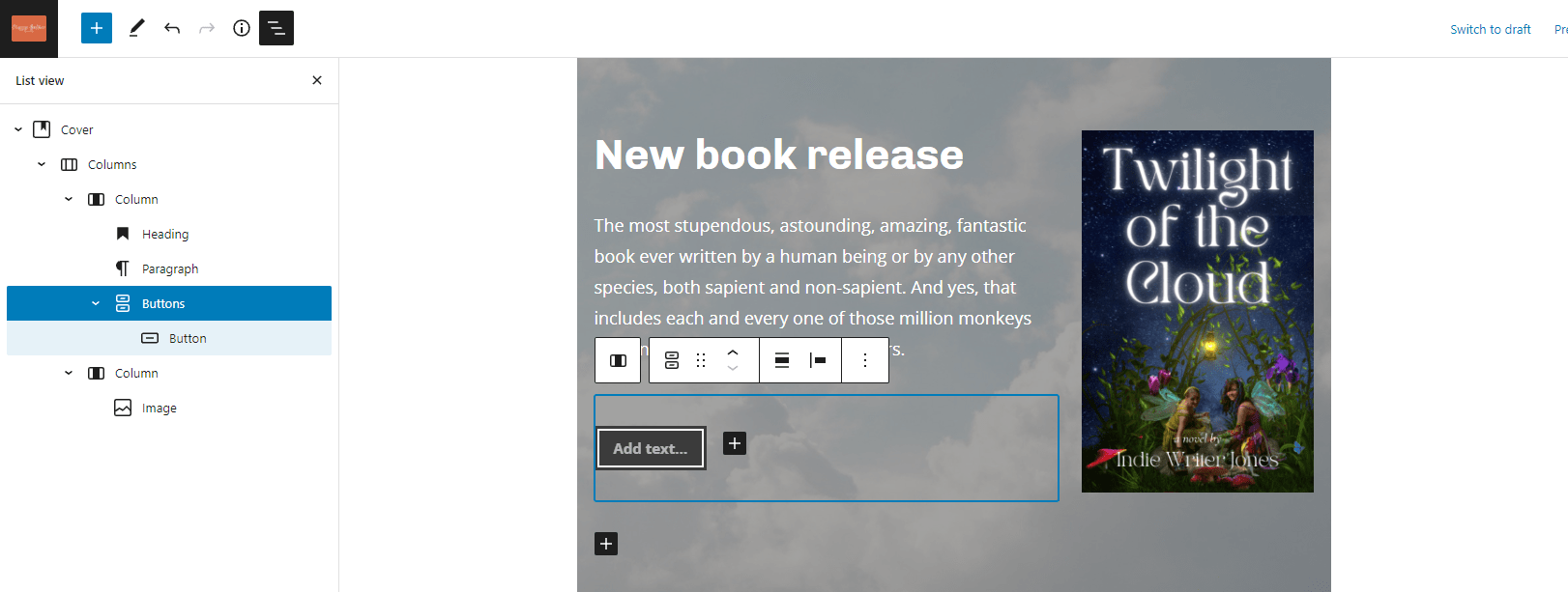
The “Buttons” block actually adds two blocks, as you can see in the left-hand blocks list — a “Buttons” block and, inside it, a “Button” block. I can have a whole row of buttons. For example, I might have a button that says “Buy on Amazon” and another that says “Buy at Bookshop.” I’m just going to put one, “Buy now,” and link it to the book’s Amazon page. Which I actually don’t have, because it’s a fake book by a fake author.
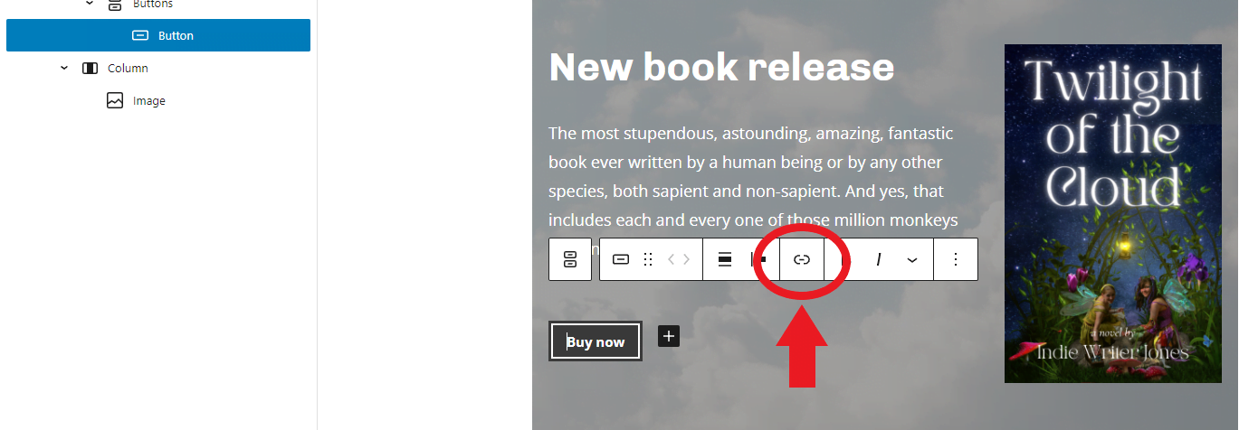
I’m just going to point it to the Amazon home page:
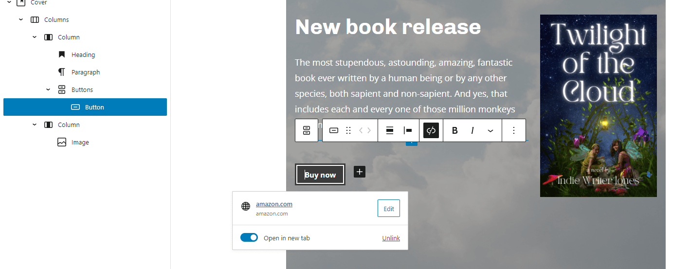
I’m also going to turn on the “Open in new tab” option, so that if visitors click on the link they’ll get Amazon in a new tab. That way, they can easily go back to my site and buy more books!
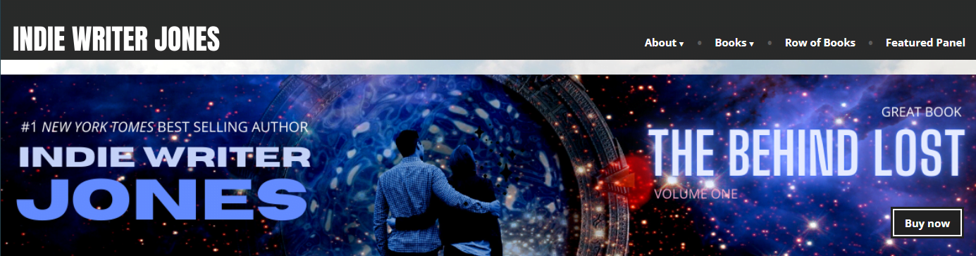
My featured panel is done. Let’s see how it looks on the page. I’m going to click on the blue “Update” button at the top right of my screen — it would be a “Publish” button if you’re working on a brand-new page. Then I’m going to open a new tab and navigate to that page to see what it looks like:
Oh, that’s not good at all! All the pieces are there, sure, and the button works, but a panel is supposed to be a panel, not a square box in the middle of the page!
Let’s go back and do some formatting.
First, select the cover by clicking on the cloud background image, or by clicking on “Cover” in the block list in the side bar.
A tool menu will pop up just above the “Cover” block. To make the block stretch the whole width of the screen, we’ll need to change its alignment.
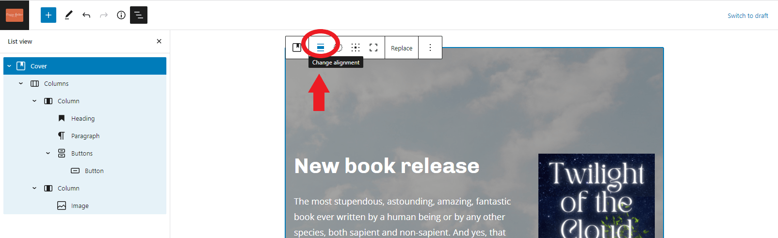
The alignment button is three horizontal lines, the middle one fatter than the ones above and below it. Click it and select “Full width.” Now the “Cover” block will go the full width of the screen.
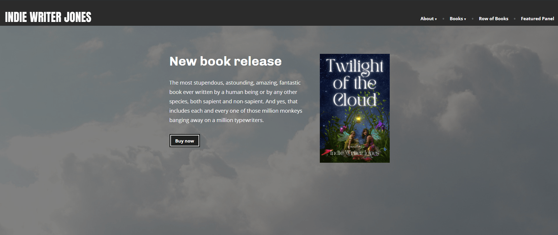
Already much better! Now it looks like a panel!
But let’s make a couple of other cosmetic fixes. First of all, I don’t like how tall the block is. There’s too much empty space below the text and the picture of the book. I also don’t like how dark it is. I want it lighter. I also want to add a cool “parallax” effect to make it seem that my text and book image are floating in front of the clouds.
We make these changes in the right-hand settings panel.
Click on the “Cover” block again and this time cast your eyes to the right.
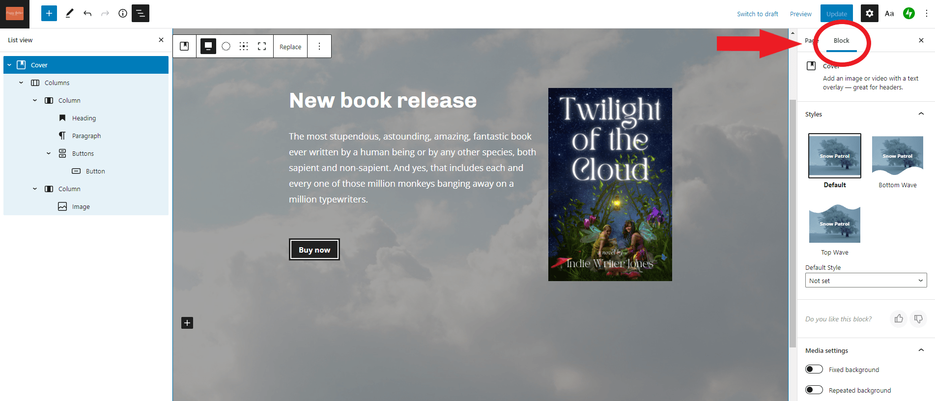
There are two tabs there. One is the “Page” tab. That gives you all the settings for the page as a whole, such as the name of its author, and whether comments are allowed. The “Block” tab gives you the settings for the particular block you’ve selected.
You can scroll up and down in that panel to see all the settings.
First, I’m going to set up the parallax effect. Under “Media settings” I’ll enable “Fixed background.”
Then I’m going to make the cloud brighter. Under “Overlay” I’ll change the “Opacity” to 0%. And under “Dimensions” I’ll set “Minimum height of cover” to “100.”
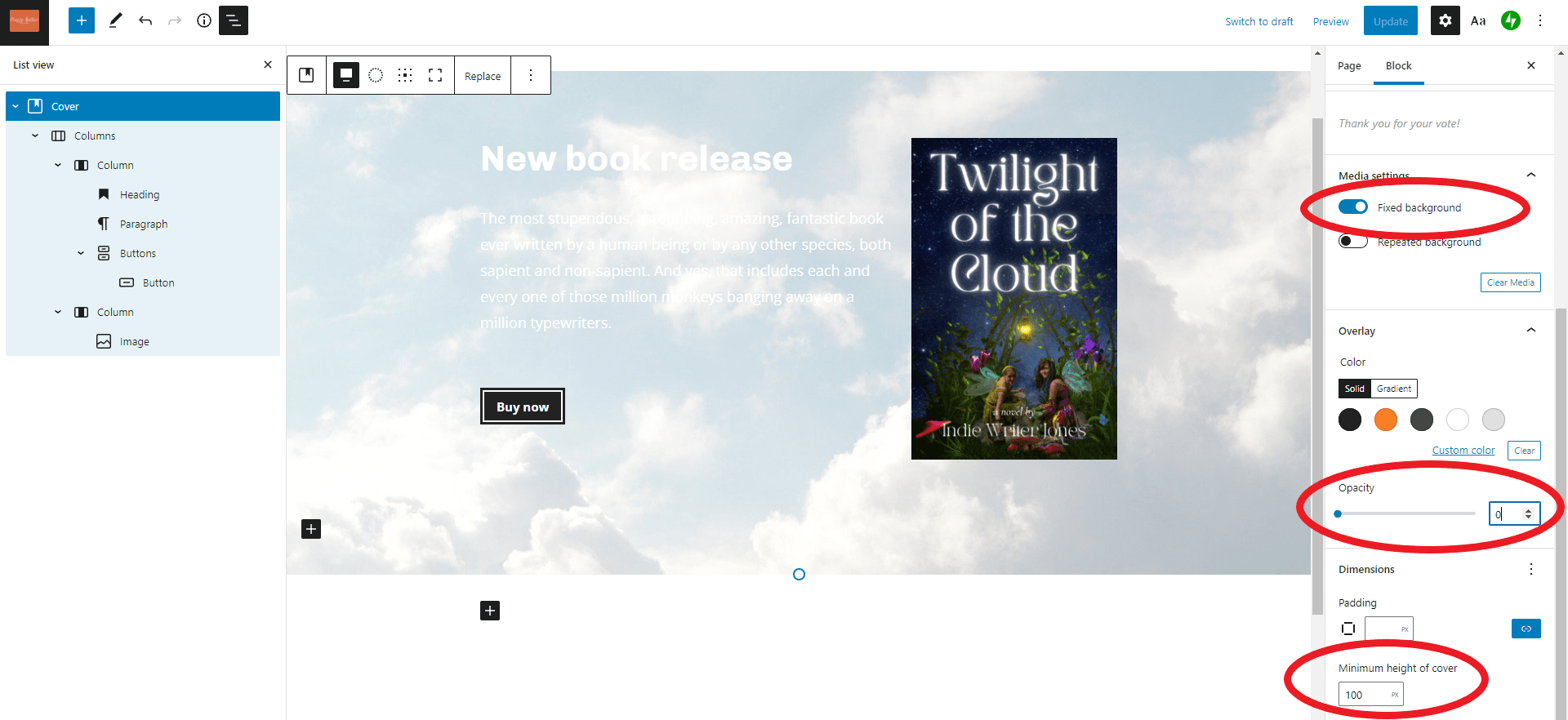
Now let’s hit the blue “Update” button and see what the final result looks like:
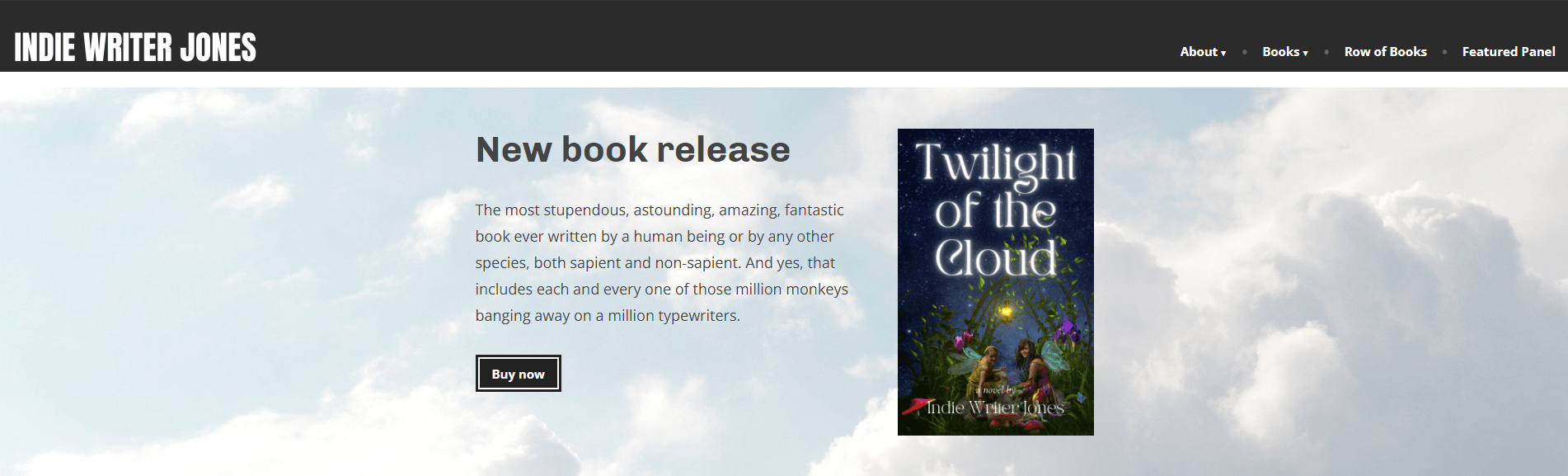
It’s perfect!
WordPress even automatically changed the text color from white to dark so that it’s visible against the now-lighter cloud background.
Why do it this way, and not as a separate image? Well, first of all, it’s a lot easier to change. You can just type in new next or swap out the book cover and you’re all set — you don’t need to get a whole new image panel made.
Plus, it’s copy-and-paste-able. Someone might want to copy-and-paste your name or your book title so that they, can, say, email all their friends about it.
It also becomes more searchable by search engines. Search engines have a hard time reading text that’s inside of images. But they do fine are reading plain text. Plus, the fact that some of the text is marked as a header makes them pay extra attention to it.
It’s also easier for people who have vision issues. They can increase the text size or change the contrast or have the computer read the text out loud to them.
Finally, this approach is easier on mobile devices. If you load the site on different size screens, WordPress automatically rearranges things so that they fit on the screen better. When your featured panel is just one single image, there’s nothing to rearrange — it just gets shrunk down. That might make it hard for some people to read.
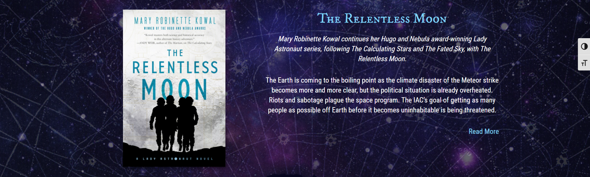
For some more design inspiration for this kind of featured book panel, here is Mary Robinette Kowal‘s panel for The Relentless Moon:
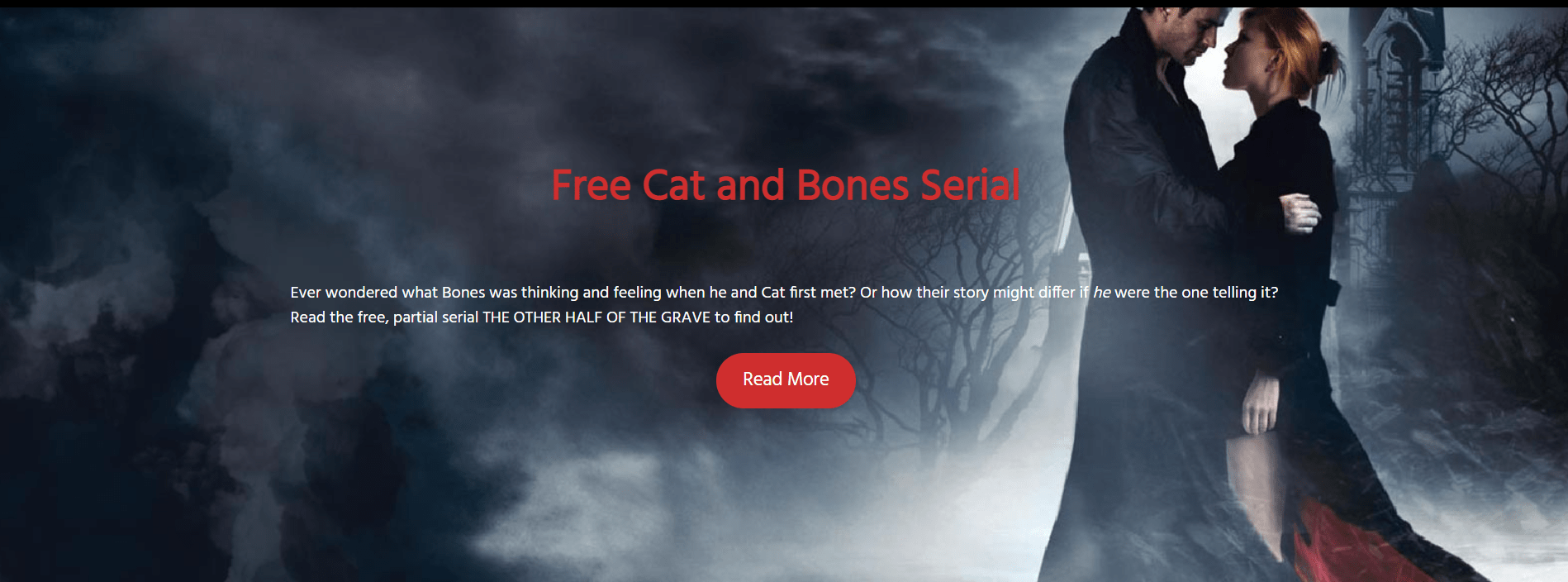
In this panel from Jeaniene Frost’s website, she has all the same elements, just left out the book cover itself and centered the heading and the text:
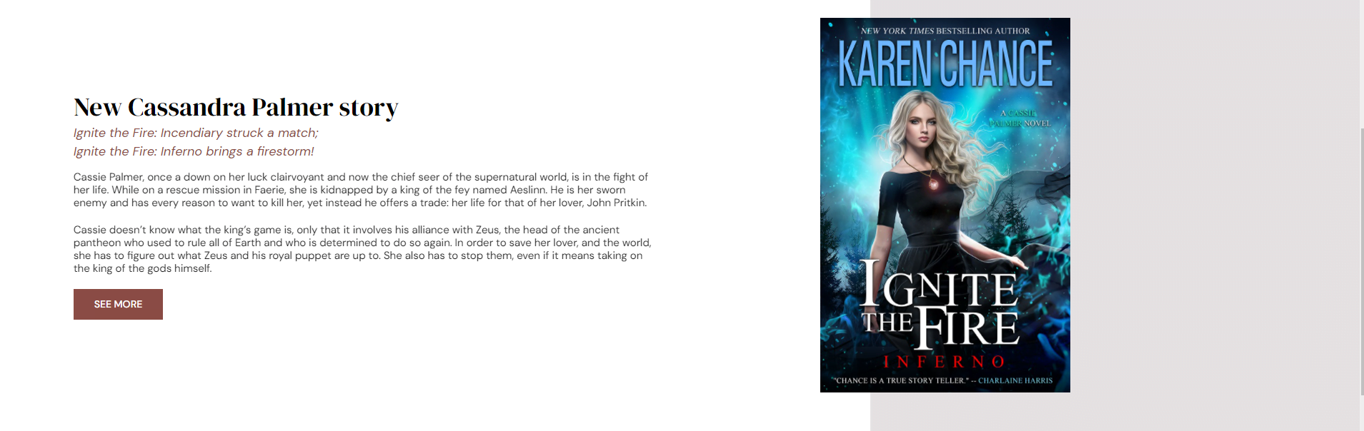
And in this panel from Karen Chance’s website, it’s all the same elements again but the background image for the “Cover” block is just a couple of solid blocks of different shades of gray.
Hopefully, you now have some tools under your belt for creating featured book panels on your author site — or, at least, an appreciation of what website designers have to go through to do them!
If you have any questions, let me know in the comments below!
Edited by Melody Friedenthal

MetaStellar editor and publisher Maria Korolov is a science fiction novelist, writing stories set in a future virtual world. And, during the day, she is an award-winning freelance technology journalist who covers artificial intelligence, cybersecurity and enterprise virtual reality. See her Amazon author page here and follow her on Twitter, Facebook, or LinkedIn, and check out her latest videos on the Maria Korolov YouTube channel. Email her at [email protected]. She is also the editor and publisher of Hypergrid Business, one of the top global sites covering virtual reality.